Chart position — tracked daily by LaunchShots
Screenshot changes — detected by LaunchShots
Screenshot style breakdown
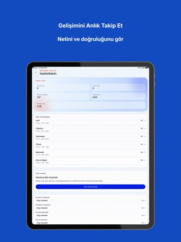
Sampled from 6 of KPSS 2026 Cepte Eğitim's App Store screenshots — background, accent and theme, measured by LaunchShots (not something Apple publishes).
#ECF4FC bg
#CFD6DD
#043484 accent
#111111 text
Screenshots






iPad screenshots




Icon palette
About this app
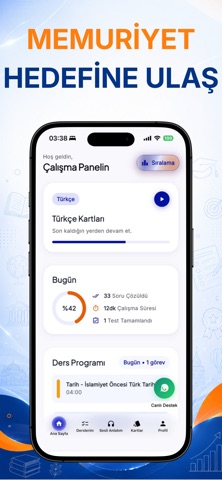
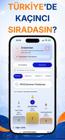
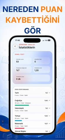
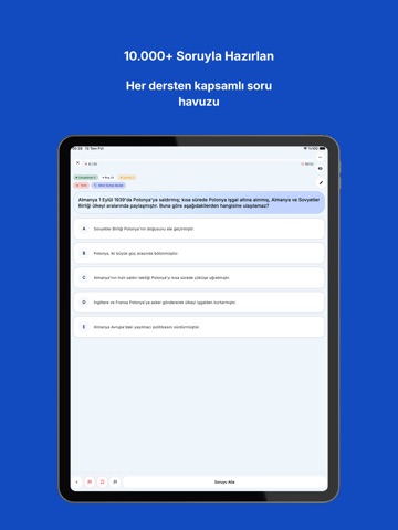
Cepte KPSS, sınava hazırlık sürecini daha düzenli, anlaşılır ve sürdürülebilir hâle getirmek için tasarlanmış kapsamlı bir çalışma uygulamasıdır. Türkçe, Matematik, Tarih, Coğrafya, Vatandaşlık ve Güncel Bilgiler derslerinde 10.000’den fazla soruyla bilgini pekiştir, eksiklerini gör ve çalışma düzenini adım adım geliştir. Cepte KPSS ile: • Konu testleri çöz • Branş ve genel denemelerle kendini ölç • Soruların ayrıntılı çözümlerini incele • Yanlışlarını, favorilerini ve notlarını takip et • Ders ve konu bazında ilerlemeni görüntüle • Sesli konu anlatımlarıyla istediğin yerde tekrar yap • Coğrafya harita etkinlikleriyle görsel öğrenmeyi güçlendir • Çalışma istatistiklerini takip ederek güçlü ve geliştirilmesi gereken alanlarını keşfet Çevrimdışı çalışma desteği sayesinde internet bağlantın olmadığında da birçok içeriğe erişebilir, hazırlığına kaldığın yerden devam edebilirsin. Ücrets…
App details
What you can learn from KPSS 2026 Cepte Eğitim
Every shipping app on the App Store has gone through the same decisions you're working through right now: which screenshot goes first, what caption sits over it, which device frame to show, what color the background should be. The 16 screenshots above are KPSS 2026 Cepte Eğitim's answers to those questions — they're public, they're real, and they made it through Apple's review.
What the numbers say: KPSS 2026 Cepte Eğitim runs a light set with one background colour (#ECF4FC) carried across every screenshot — the listing reads as a single poster when the shots sit side by side in search results. The accent colour we picked up, #043484, is the one to reuse for badges, arrows and highlighted words if you borrow this look. Hit Use this style to open the editor with these exact colours and drop your own screenshot in.
Notice the first screenshot in particular. It's the one users see in search results and on the product page, and it's where most apps spend their best caption and tightest design. Look at the proportion of background to phone, where the text sits, what one thing the image is trying to communicate.
Want to see how other Education apps approach the same problem? Browse more Education apps in the showcase.
Take what works into your own screenshots
Open LaunchShots and design your App Store & Google Play screenshots — pick a device frame, drop captions, ship in minutes. Free, in your browser.
Open the screenshot editor →Apps with a similar look
Closest background + accent colours among the listings we've analysed — useful when you want to see the same palette handled by a different team.