Chart position — tracked daily by LaunchShots
Screenshot style breakdown
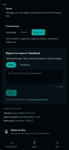
Sampled from 4 of Gdzie te fale's App Store screenshots — background, accent and theme, measured by LaunchShots (not something Apple publishes).
#04040C bg
#27272E
#546CD4 accent
#FFFFFF text
Reading the caption text from the screenshots in your browser…
Screenshots


Icon palette
About this app
Prognoza fal, która nie kończy się na otwartym morzu. Większość prognoz surfingowych podaje falę kilkadziesiąt kilometrów od brzegu. „Gdzie te fale" doprowadza ją aż do plaży — i odpowiada na pytania „czy ten spot działa?" oraz „gdzie działa najlepiej?". CEL Pokazać możliwie najdokładniejsze odwzorowanie warunków — tak, jakbyś stał w tej chwili na spocie. JAK TO DZIAŁA Przybrzeżna symulacja fizyczna, wsparta szczegółową batymetrią, oblicza, jak fale zmieniają się w drodze do brzegu. Te same naukowe narzędzia pozwalają ocenić warunki i falę pod względem jakości — dowiesz się, czy szykuje się niesamowita sesja, czy raczej słaba. W APLIKACJI • Prognoza do 7 dni dla każdego spotu, z uczciwą oceną jakości • Mapa jako narzędzie analizy — szybko znajdziesz swój spot • Przybrzeżna fizyka — matematyczny model transformacji falowania, analiza oparta na pracach naukowych, a nie ogólny feed z o…
App details
What you can learn from Gdzie te fale
Every shipping app on the App Store has gone through the same decisions you're working through right now: which screenshot goes first, what caption sits over it, which device frame to show, what color the background should be. The 4 screenshots above are Gdzie te fale's answers to those questions — they're public, they're real, and they made it through Apple's review.
What the numbers say: Gdzie te fale runs a mixed light-and-dark set where the background shifts from screenshot to screenshot (first shot #04040C) — each image has to stand on its own, so the captions carry more of the story. The accent colour we picked up, #546CD4, is the one to reuse for badges, arrows and highlighted words if you borrow this look. Hit Use this style to open the editor with these exact colours and drop your own screenshot in.
Notice the first screenshot in particular. It's the one users see in search results and on the product page, and it's where most apps spend their best caption and tightest design. Look at the proportion of background to phone, where the text sits, what one thing the image is trying to communicate.
Want to see how other Weather apps approach the same problem? Browse more Weather apps in the showcase.
Take what works into your own screenshots
Open LaunchShots and design your App Store & Google Play screenshots — pick a device frame, drop captions, ship in minutes. Free, in your browser.
Open the screenshot editor →Apps with a similar look
Closest background + accent colours among the listings we've analysed — useful when you want to see the same palette handled by a different team.