Chart position — tracked daily by LaunchShots
Screenshot style breakdown
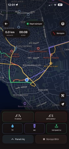
Sampled from 6 of MotoAtlas's App Store screenshots — background, accent and theme, measured by LaunchShots (not something Apple publishes).
#141414 bg
#343434
#FCC43C accent
#FFFFFF text
Screenshots

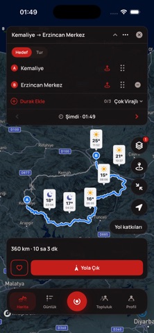

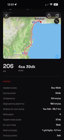

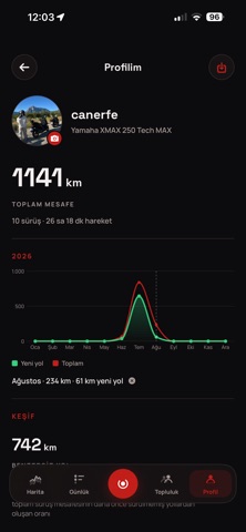

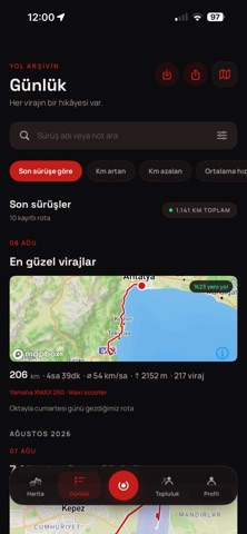
Icon palette
About this app
MotoAtlas, motosiklet sürüşlerini planlamak, kaydetmek ve kişisel yol arşivini oluşturmak için geliştirilmiş bir motosiklet uygulamasıdır. ROTA PLANLAMA Gitmek istediğin yeri seç veya kaç kilometrelik bir tur aradığını belirt. MotoAtlas sana Hızlı, Dengeli, Virajlı, Çok Virajlı ve daha önce sürmediğin yolları öne çıkaran Keşif seçenekleriyle rotalar oluşturur. ÜÇ FARKLI ROTA Her tur için üç farklı rota seçeneği sunulur. Seçenekler arasında anında geçebilir veya “3 Yeni Rota” ile yeni alternatifler oluşturabilirsin. YOL BOYUNCA HAVA Rotanın üzerindeki hava koşullarını planladığın kalkış saatine göre gör. Kalkış saatini değiştirerek yolculuk boyunca havanın nasıl değişeceğini incele. ROTANI KAYDET VE AKTAR Beğendiğin rotaları kaydet; Profil > Kaydedilen Rotalar bölümünden tekrar aç. Rotanı Apple Haritalar, Google Haritalar veya Yandex Haritalar’a aktarabilir, navigasyonla birl…
App details
What you can learn from MotoAtlas
Every shipping app on the App Store has gone through the same decisions you're working through right now: which screenshot goes first, what caption sits over it, which device frame to show, what color the background should be. The 9 screenshots above are MotoAtlas's answers to those questions — they're public, they're real, and they made it through Apple's review.
What the numbers say: MotoAtlas runs a dark set where the background shifts from screenshot to screenshot (first shot #141414) — each image has to stand on its own, so the captions carry more of the story. The accent colour we picked up, #FCC43C, is the one to reuse for badges, arrows and highlighted words if you borrow this look. Hit Use this style to open the editor with these exact colours and drop your own screenshot in.
Notice the first screenshot in particular. It's the one users see in search results and on the product page, and it's where most apps spend their best caption and tightest design. Look at the proportion of background to phone, where the text sits, what one thing the image is trying to communicate.
Want to see how other Navigation apps approach the same problem? Browse more Navigation apps in the showcase.
Take what works into your own screenshots
Open LaunchShots and design your App Store & Google Play screenshots — pick a device frame, drop captions, ship in minutes. Free, in your browser.
Open the screenshot editor →Apps with a similar look
Closest background + accent colours among the listings we've analysed — useful when you want to see the same palette handled by a different team.