Chart position — tracked daily by LaunchShots
Screenshot style breakdown
Sampled from 5 of Như Vầy Tôi Nghe's App Store screenshots — background, accent and theme, measured by LaunchShots (not something Apple publishes).
#E4DCCC bg
#C8C1B3
#CCA474 accent
#111111 text
Reading the caption text from the screenshots in your browser…
Screenshots


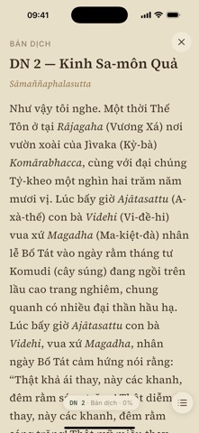
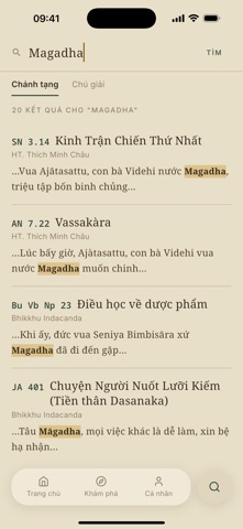

iPad screenshots


Icon palette
About this app
"Như Vầy Tôi Nghe" (Evaṃ me sutaṃ) là câu mở đầu của phần lớn các bài kinh trong Kinh tạng Pāli, lời Tôn giả Ānanda thuật lại những gì đã được nghe trực tiếp từ Đức Thế Tôn. Tên gọi ấy nhắc người đọc trở về với chính kinh văn: lắng nghe, suy xét và học hỏi lời dạy của Đức Phật cùng các vị Thánh đệ tử được lưu truyền trong Kinh tạng. Ứng dụng được thực hiện với một mong muốn giản dị là đem kinh văn đến gần hơn với người đọc, để mỗi người có thể tự mình đọc, tìm hiểu và thực hành theo những gì đã được nghe, theo tiến trình Văn – Tư – Tu (nghe/học, suy xét, thực hành). Hy vọng rằng Như Vầy Tôi Nghe có thể góp một phần nhỏ để việc đọc, tra cứu và tìm hiểu Kinh tạng trở nên thuận tiện hơn, với nội dung tương đối đầy đủ, cách trình bày trang nhã và dễ đọc đối với người Việt. Kinh tạng và Luật tạng Nội dung hiện bao gồm đầy đủ năm bộ Nikāya: * Trường Bộ (Dīgha Nikāya) * Trung Bộ (Majjhima Ni…
App details
What you can learn from Như Vầy Tôi Nghe
Every shipping app on the App Store has gone through the same decisions you're working through right now: which screenshot goes first, what caption sits over it, which device frame to show, what color the background should be. The 10 screenshots above are Như Vầy Tôi Nghe's answers to those questions — they're public, they're real, and they made it through Apple's review.
What the numbers say: Như Vầy Tôi Nghe runs a light set with one background colour (#E4DCCC) carried across every screenshot — the listing reads as a single poster when the shots sit side by side in search results. The accent colour we picked up, #CCA474, is the one to reuse for badges, arrows and highlighted words if you borrow this look. Hit Use this style to open the editor with these exact colours and drop your own screenshot in.
Notice the first screenshot in particular. It's the one users see in search results and on the product page, and it's where most apps spend their best caption and tightest design. Look at the proportion of background to phone, where the text sits, what one thing the image is trying to communicate.
Want to see how other Book apps approach the same problem? Browse more Book apps in the showcase.
Take what works into your own screenshots
Open LaunchShots and design your App Store & Google Play screenshots — pick a device frame, drop captions, ship in minutes. Free, in your browser.
Open the screenshot editor →Apps with a similar look
Closest background + accent colours among the listings we've analysed — useful when you want to see the same palette handled by a different team.