Chart position — tracked daily by LaunchShots
Screenshot style breakdown
Sampled from 6 of Pokejakt: TCG Card Scanner's App Store screenshots — background, accent and theme, measured by LaunchShots (not something Apple publishes).
#F4FCFC bg
#D6DDDD
#FC94B4 accent
#111111 text
Reading the caption text from the screenshots in your browser…
Screenshots




iPad screenshots


Icon palette
About this app
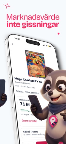
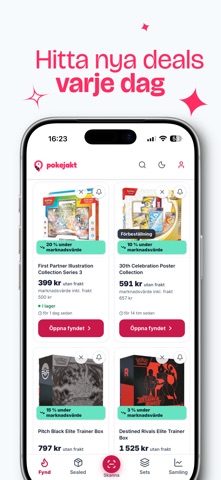
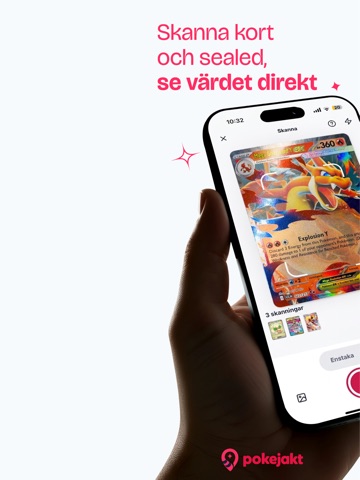
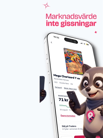
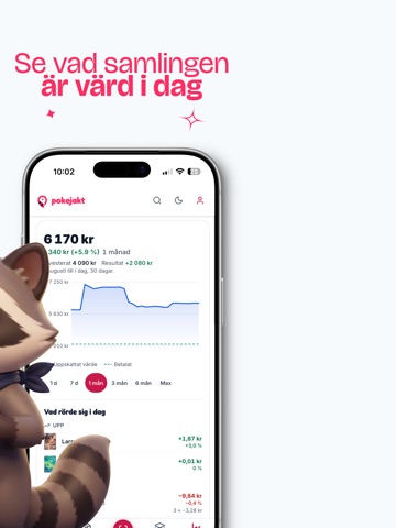
Skanna dina samlarkort och se uppskattat kortvärde i kronor. Pokejakt är en TCG card scanner som hjälper dig att jämföra svenska butikspriser, bygga din kortsamling och förbereda annonser på Tradera. SKANNA OCH VÄRDERA Rikta kameran mot kortet och granska träffen. Skannern stöder Pokémon, Magic, One Piece, Yu-Gi-Oh!, Lorcana och Riftbound. Du kan byta spel direkt i kameran. Tillgänglig prisinformation varierar mellan kort och spel. Värden är uppskattningar och innebär inte ett garanterat försäljningspris. JÄMFÖR BUTIKSPRISER Hitta kort, booster boxar och andra oöppnade produkter hos svenska och nordiska butiker. Jämför priser och lagerstatus, och se fraktinformation där den finns. DIN SAMLING Spara korten du äger och följ samlingens uppskattade värde. Håll ordning på innehavet och se tillgänglig prisutveckling. FYND OCH PRISBEVAKNINGAR Utforska fynd och bevaka produkter du är intres…
App details
What you can learn from Pokejakt: TCG Card Scanner
Every shipping app on the App Store has gone through the same decisions you're working through right now: which screenshot goes first, what caption sits over it, which device frame to show, what color the background should be. The 12 screenshots above are Pokejakt: TCG Card Scanner's answers to those questions — they're public, they're real, and they made it through Apple's review.
What the numbers say: Pokejakt: TCG Card Scanner runs a light set with one background colour (#F4FCFC) carried across every screenshot — the listing reads as a single poster when the shots sit side by side in search results. The accent colour we picked up, #FC94B4, is the one to reuse for badges, arrows and highlighted words if you borrow this look. Hit Use this style to open the editor with these exact colours and drop your own screenshot in.
Notice the first screenshot in particular. It's the one users see in search results and on the product page, and it's where most apps spend their best caption and tightest design. Look at the proportion of background to phone, where the text sits, what one thing the image is trying to communicate.
Want to see how other Utilities apps approach the same problem? Browse more Utilities apps in the showcase.
Take what works into your own screenshots
Open LaunchShots and design your App Store & Google Play screenshots — pick a device frame, drop captions, ship in minutes. Free, in your browser.
Open the screenshot editor →Apps with a similar look
Closest background + accent colours among the listings we've analysed — useful when you want to see the same palette handled by a different team.