Chart position — tracked daily by LaunchShots
Screenshot style breakdown
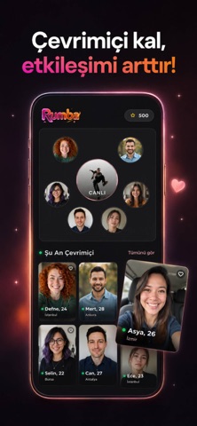
Sampled from 4 of Rumba - Canlı Sohbet's App Store screenshots — background, accent and theme, measured by LaunchShots (not something Apple publishes).
#140C14 bg
#342E34
#64442C accent
#FFFFFF text
Reading the caption text from the screenshots in your browser…
Screenshots



Icon palette
About this app
Sosyal çemberinizi genişletmek, daha önce hiç karşılaşmadığınız insanlarla tanışmak ve benzer tutkuları paylaştığınız kullanıcılarla bir araya gelmek artık çok daha keyifli. Rumba, tam olarak bu amaçla tasarlanmış, modern ve kullanıcı dostu bir sosyal keşif uygulamasıdır. Klasikleşmiş sosyal ağ kalıplarının ötesine geçen Rumba, sade ve akıcı mimarisi sayesinde uygulama içindeki geçişleri zahmetsiz hale getirir. Farklı yaşam tarzlarına sahip profilleri inceleyebilir, sizinle aynı dalga boyundaki insanları kolayca fark edebilirsiniz. Günlük koşturmacanız arasında sosyal etkileşimi doğal bir ritme oturtan platform, yeni dostlukların kapısını aralar. İster yepyeni bir çevre edinmek, ister sadece ortak ilgi alanlarınız üzerinden keyifli sohbetler başlatmak isteyin; Rumba her an yanınızdadır. İlgi duyduğunuz profilleri keşfederken zamandan tasarruf eder, samimi ve kaliteli bağlar kurma fırs…
App details
What you can learn from Rumba - Canlı Sohbet
Every shipping app on the App Store has gone through the same decisions you're working through right now: which screenshot goes first, what caption sits over it, which device frame to show, what color the background should be. The 4 screenshots above are Rumba - Canlı Sohbet's answers to those questions — they're public, they're real, and they made it through Apple's review.
What the numbers say: Rumba - Canlı Sohbet runs a dark set with one background colour (#140C14) carried across every screenshot — the listing reads as a single poster when the shots sit side by side in search results. The accent colour we picked up, #64442C, is the one to reuse for badges, arrows and highlighted words if you borrow this look. Hit Use this style to open the editor with these exact colours and drop your own screenshot in.
Notice the first screenshot in particular. It's the one users see in search results and on the product page, and it's where most apps spend their best caption and tightest design. Look at the proportion of background to phone, where the text sits, what one thing the image is trying to communicate.
Want to see how other Entertainment apps approach the same problem? Browse more Entertainment apps in the showcase.
Take what works into your own screenshots
Open LaunchShots and design your App Store & Google Play screenshots — pick a device frame, drop captions, ship in minutes. Free, in your browser.
Open the screenshot editor →Apps with a similar look
Closest background + accent colours among the listings we've analysed — useful when you want to see the same palette handled by a different team.