Chart position — tracked daily by LaunchShots
Screenshot style breakdown
Sampled from 5 of Khoảng cách an toàn's App Store screenshots — background, accent and theme, measured by LaunchShots (not something Apple publishes).
#043C24 bg
#275742
#3C8464 accent
#FFFFFF text
Reading the caption text from the screenshots in your browser…
Screenshots


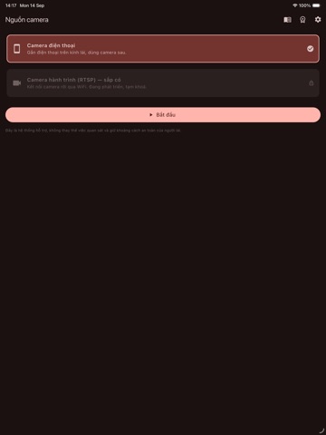
iPad screenshots


Icon palette
About this app
Ứng dụng Khoảng cách an toàn là công cụ HỖ TRỢ LÁI XE: dùng camera điện thoại gắn trên kính lái để phát hiện xe ô tô phía trước và nhắc bạn khi đang theo quá gần. App dùng camera, AI nhận diện và GPS LIÊN TỤC nên có thể làm máy ấm hơn và hao pin nhanh hơn bình thường khi chạy dài — nên cắm sạc trong xe. Có sẵn 'Chế độ tiết kiệm pin / chống nóng' trong Cài đặt để giảm bớt. TÍNH NĂNG • Nhận diện xe phía trước bằng mô hình thị giác máy chạy ngay trên điện thoại (không gửi hình ảnh đi đâu). • Ước lượng khoảng cách tới xe trước và so với mức an toàn theo tốc độ GPS. • Ngưỡng an toàn theo Thông tư 38/2024/TT-BGTVT: 60 km/h → 35 m, 80 → 55 m, 100 → 70 m, 120 → 100 m; dưới 60 km/h dùng quy tắc 2 giây. Có biên an toàn tuỳ chọn và chế độ đường xấu. • Cảnh báo bằng màu trên màn hình (an toàn / chú ý / nguy hiểm) và bằng giọng nói tiếng Việt — rảnh tay, không cần nhìn lâu. • Tự hiệu chỉnh …
App details
What you can learn from Khoảng cách an toàn
Every shipping app on the App Store has gone through the same decisions you're working through right now: which screenshot goes first, what caption sits over it, which device frame to show, what color the background should be. The 8 screenshots above are Khoảng cách an toàn's answers to those questions — they're public, they're real, and they made it through Apple's review.
What the numbers say: Khoảng cách an toàn runs a dark set with one background colour (#043C24) carried across every screenshot — the listing reads as a single poster when the shots sit side by side in search results. The accent colour we picked up, #3C8464, is the one to reuse for badges, arrows and highlighted words if you borrow this look. Hit Use this style to open the editor with these exact colours and drop your own screenshot in.
Notice the first screenshot in particular. It's the one users see in search results and on the product page, and it's where most apps spend their best caption and tightest design. Look at the proportion of background to phone, where the text sits, what one thing the image is trying to communicate.
Want to see how other Navigation apps approach the same problem? Browse more Navigation apps in the showcase.
Take what works into your own screenshots
Open LaunchShots and design your App Store & Google Play screenshots — pick a device frame, drop captions, ship in minutes. Free, in your browser.
Open the screenshot editor →Apps with a similar look
Closest background + accent colours among the listings we've analysed — useful when you want to see the same palette handled by a different team.