Chart position — tracked daily by LaunchShots
Screenshot style breakdown
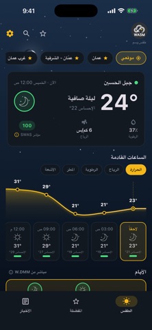
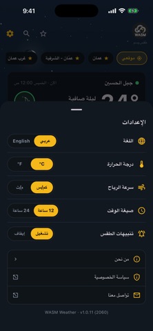
Sampled from 5 of WASM Weather's App Store screenshots — background, accent and theme, measured by LaunchShots (not something Apple publishes).
#141C24 bg
#343B42
#F4BC1C accent
#FFFFFF text
Reading the caption text from the screenshots in your browser…
Screenshots


Icon palette
About this app
يقدّم لك طقس وسم التوقعات الجوية حيث أنت بالضبط، حتى مستوى الحي، في جميع الدول العربية الاثنتين والعشرين. معظم تطبيقات الطقس تعطيك رأي نموذج جوي واحد. أما وسم فيقوم على W.DMM، وهو محرّك التنبؤ الخاص بنا: يدمج عدة نماذج جوية عالمية رائدة في توقع واحد، ثم يقارنه بالرصد الفعلي على الأرض. وحين تختلف النماذج فيما بينها، نحسم هذا الاختلاف بدلاً من أن نتركه لك. ما الذي ستحصل عليه • تفاصيل كل ساعة للأيام الخمسة القادمة: درجة الحرارة، والإحساس الفعلي بها، والرياح، والرطوبة، والغيوم، واحتمال الأمطار، ومدى الرؤية. • مؤشر SWAS: رقم واحد من 0 إلى 100 يوضح مدى ملاءمة كل ساعة للعمل والنشاط، مبني على العامل الأكثر تأثيراً في تلك الساعة، لا على متوسط يُخفيه. • وعي بالطقس الشديد: الغبار والضباب والعواصف الرعدية والإجهاد الحراري محسوبة بوضوح، لا مختبئة داخل أيقونة. • تنبيهات الطقس لموقعك: إشعار في المساء السابق وصباح يوم الحالة الجوية، عند توقع أمطار أو غبار أو رياح أو حر أو برد، ويمكنك إيقافها في أي و…
App details
What you can learn from WASM Weather
Every shipping app on the App Store has gone through the same decisions you're working through right now: which screenshot goes first, what caption sits over it, which device frame to show, what color the background should be. The 5 screenshots above are WASM Weather's answers to those questions — they're public, they're real, and they made it through Apple's review.
What the numbers say: WASM Weather runs a dark set with one background colour (#141C24) carried across every screenshot — the listing reads as a single poster when the shots sit side by side in search results. The accent colour we picked up, #F4BC1C, is the one to reuse for badges, arrows and highlighted words if you borrow this look. Hit Use this style to open the editor with these exact colours and drop your own screenshot in.
Notice the first screenshot in particular. It's the one users see in search results and on the product page, and it's where most apps spend their best caption and tightest design. Look at the proportion of background to phone, where the text sits, what one thing the image is trying to communicate.
Want to see how other Weather apps approach the same problem? Browse more Weather apps in the showcase.
Take what works into your own screenshots
Open LaunchShots and design your App Store & Google Play screenshots — pick a device frame, drop captions, ship in minutes. Free, in your browser.
Open the screenshot editor →Apps with a similar look
Closest background + accent colours among the listings we've analysed — useful when you want to see the same palette handled by a different team.