Chart position — tracked daily by LaunchShots
Screenshot style breakdown
Sampled from 4 of Sổ Tiêm Chủng's App Store screenshots — background, accent and theme, measured by LaunchShots (not something Apple publishes).
#045C7C bg
#27728E
#EC8C94 accent
#FFFFFF text
Screenshots
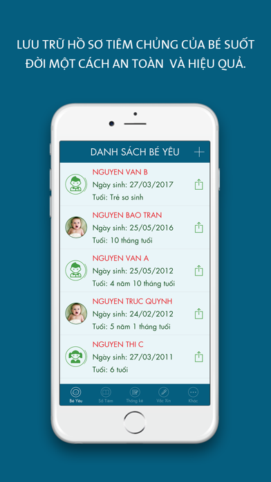


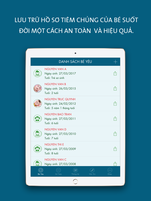
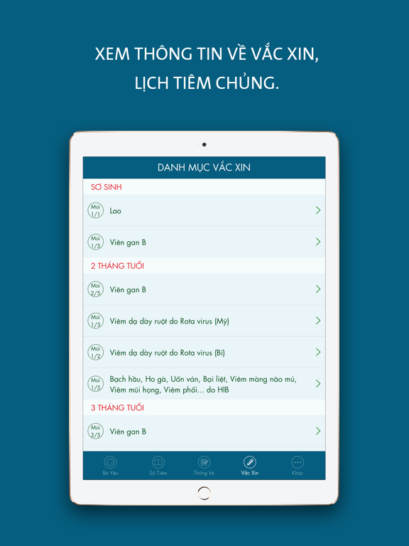
iPad screenshots


Icon palette
About this app
Một số vấn đề chúng ta gặp phải: - Đánh mất sổ tiêm chủng của trẻ, hoặc mất rất nhiều thời gian tìm kiếm? - Bạn không nhớ đã tiêm mũi nào? mũi nào chưa tiêm? - Bao giờ có mũi tiêm tiếp theo? bạn bận rộn nên quên ngày tiêm cho trẻ? - Bạn cần tìm hiểu thông tin về các loại vắc xin? Ứng dụng "Sổ Tiêm Chủng" sẽ giúp quý vị không còn lo lắng về những điều đó nữa! Các chức năng nổi bật của ứng dụng: - Ghi lại nhật ký các mũi đã tiêm: tên vắc xin, ngày tiêm, nơi tiêm & ghi chú. - Bạn sẽ được hỗ trợ theo dõi lịch tiêm của bé theo thời gian. - Thống kê tất cả các mũi tiêm ở 3 trạng thái: Đã tiêm, Sắp tiêm, Bỏ lỡ. - Bạn sẽ được thông báo mũi tiêm sắp tới để không bỏ lỡ bất kỳ mũi tiêm nào cho bé. - Bạn sẽ lưu trữ hồ sơ tiêm chủng của bé suốt đời một cách an toàn và hiệu quả. - Bạn sẽ được cung cấp nhiều lựa chọn để theo dõi hồ sơ tiêm chủng của thành viên trong gia đình. - Xem thông tin về vắc …
App details
What you can learn from Sổ Tiêm Chủng
Every shipping app on the App Store has gone through the same decisions you're working through right now: which screenshot goes first, what caption sits over it, which device frame to show, what color the background should be. The 8 screenshots above are Sổ Tiêm Chủng's answers to those questions — they're public, they're real, and they made it through Apple's review.
What the numbers say: Sổ Tiêm Chủng runs a dark set with one background colour (#045C7C) carried across every screenshot — the listing reads as a single poster when the shots sit side by side in search results. The accent colour we picked up, #EC8C94, is the one to reuse for badges, arrows and highlighted words if you borrow this look. Hit Use this style to open the editor with these exact colours and drop your own screenshot in.
Notice the first screenshot in particular. It's the one users see in search results and on the product page, and it's where most apps spend their best caption and tightest design. Look at the proportion of background to phone, where the text sits, what one thing the image is trying to communicate.
Want to see how other Health & Fitness apps approach the same problem? Browse more Health & Fitness apps in the showcase.
Take what works into your own screenshots
Open LaunchShots and design your App Store & Google Play screenshots — pick a device frame, drop captions, ship in minutes. Free, in your browser.
Open the screenshot editor →Apps with a similar look
Closest background + accent colours among the listings we've analysed — useful when you want to see the same palette handled by a different team.