Chart position — tracked daily by LaunchShots
Screenshot changes — detected by LaunchShots
Screenshot style breakdown
Sampled from 6 of Etstur: Otel & Tur & Tatil's App Store screenshots — background, accent and theme, measured by LaunchShots (not something Apple publishes).
#FCF4B4 bg
#DDD69E
#046CFC accent
#111111 text
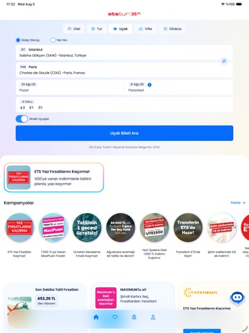
- #1Yenilenen ana sayfa, kullanıcı dostu arayüz, kampanya alanları ve çok daha fazlası ile sen
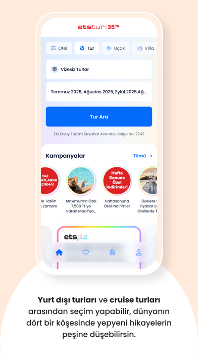
- #2I I Yurt digi turları ve cruise turları arasından seçim yapabilir, dünyanın
- #3Farklı hava yolu firmalarının uçuşlarını tek ekranda karşılaştırarak aradığın uçak biletin
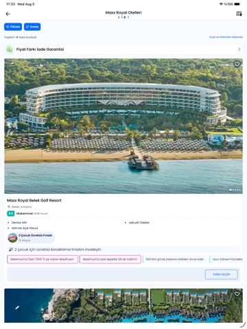
- #4Filtre özelliğini kullanarak otelleri tercihlerine göre listeleyebilir, sana uygun oteli h
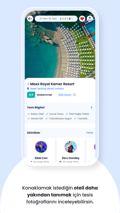
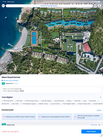
- #5Konaklamak istediğin oteli daha yakından tanımak için tesis fotoğraflarını inceleyebilirsi
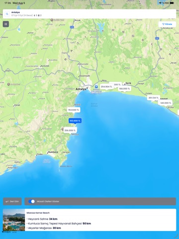
- #6Harita bölümünden tesislerin konumunu ve çevresindeki popüler yerleri inceleyebilirsin.
Captions read from the screenshots (OCR, may contain small errors): 6 headlines, 11.2 words on average (longest 14).
Screenshots





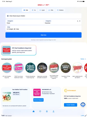
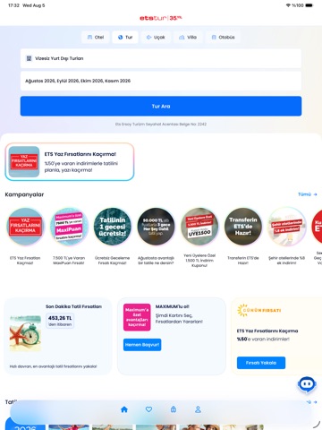
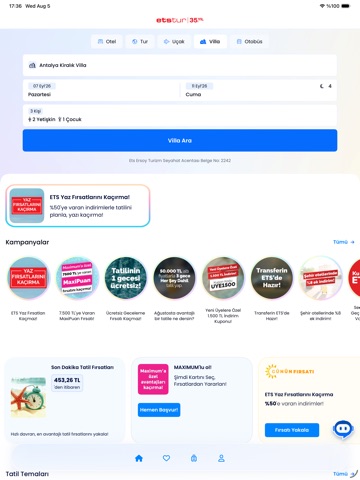
iPad screenshots

Icon palette
About this app
ETSTUR İLE SEYAHATİNİZ TEK UYGULAMADA Etstur uygulaması ile tek bir platformda kolayca otel ve villa rezervasyonunuzu yapabilir, uçak ve otobüs biletinizi alabilir, tur seçeneklerini görüntüleyebilirsiniz. Bu sayede seyahat planınızı hızlı, güvenli ve pratik şekilde tamamlayabilir, sadece tatilinize odaklanabilirsiniz. Binlerce otel alternatifi, avantajlı uçuş seçenekleri, otobüs seferleri, cruise turları ve yurt dışı tur programları, Etstur güvencesiyle her zaman yanınızda.Kullanıcı dostu arayüz sayesinde birkaç adımda rezervasyonunuzu tamamlayabilir, seyahatinizi zahmetsizce organize edebilirsiniz. OTEL, VİLLA VE DİĞER KONAKLAMA SEÇENEKLERİNİ KEŞFEDİN Şehir otellerinden tatil beldelerindeki resort tesislere, villa konaklama alternatiflerinden bungalovlara kadar geniş yelpazede seçenekler sizi bekliyor. Fiyatları karşılaştırabilir, özel kampanyalardan yararlanabilir…
App details
What you can learn from Etstur: Otel & Tur & Tatil
Every shipping app on the App Store has gone through the same decisions you're working through right now: which screenshot goes first, what caption sits over it, which device frame to show, what color the background should be. The 17 screenshots above are Etstur: Otel & Tur & Tatil's answers to those questions — they're public, they're real, and they made it through Apple's review.
What the numbers say: Etstur: Otel & Tur & Tatil runs a light set where the background shifts from screenshot to screenshot (first shot #FCF4B4) — each image has to stand on its own, so the captions carry more of the story. The accent colour we picked up, #046CFC, is the one to reuse for badges, arrows and highlighted words if you borrow this look. Hit Use this style to open the editor with these exact colours and drop your own screenshot in.
Notice the first screenshot in particular. It's the one users see in search results and on the product page, and it's where most apps spend their best caption and tightest design. Look at the proportion of background to phone, where the text sits, what one thing the image is trying to communicate.
Want to see how other Travel apps approach the same problem? Browse more Travel apps in the showcase.
Take what works into your own screenshots
Open LaunchShots and design your App Store & Google Play screenshots — pick a device frame, drop captions, ship in minutes. Free, in your browser.
Open the screenshot editor →Apps with a similar look
Closest background + accent colours among the listings we've analysed — useful when you want to see the same palette handled by a different team.