Chart position — tracked daily by LaunchShots
Screenshot style breakdown
Sampled from 6 of mew-ti's App Store screenshots — background, accent and theme, measured by LaunchShots (not something Apple publishes).
#FCFCFC bg
#DDDDDD
#04A4BC accent
#111111 text
Screenshots



iPad screenshots


Icon palette
About this app
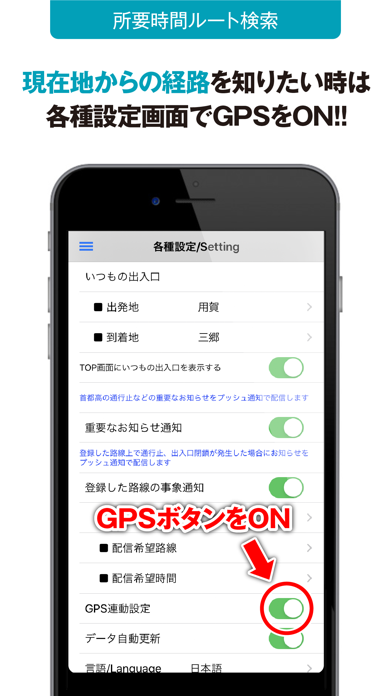
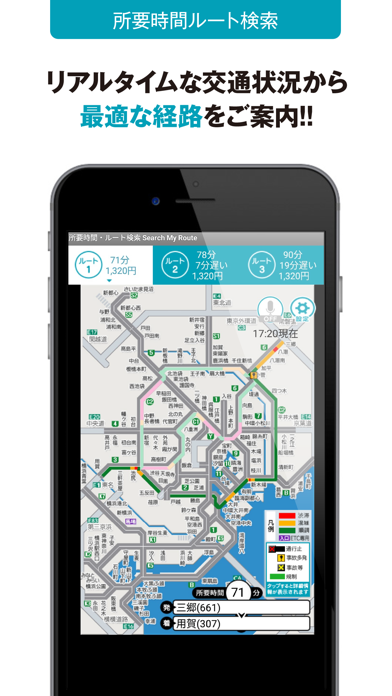
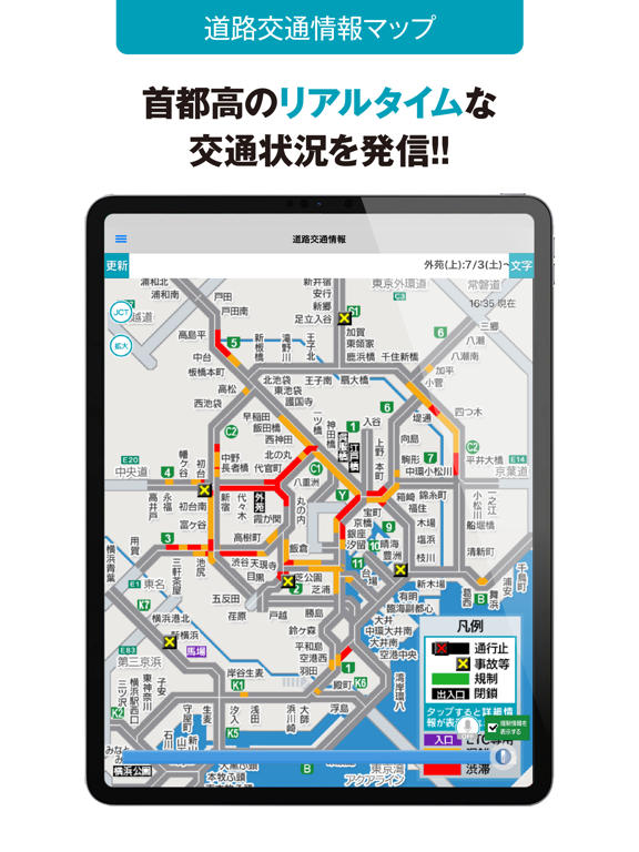
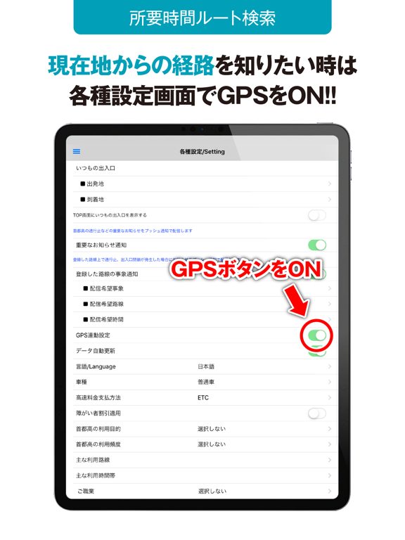
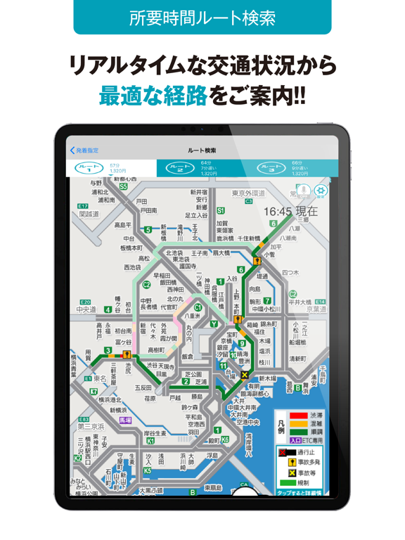
本アプリの特長・目的 ・本アプリは「首都高をかしこく運転して(使って)もらう」ため、スマートフォン特有のタッチ操作・GPS連動等による首都高専用の道路交通情報コンテンツを提供するものです。 ・コンテンツは現在・過去情報に分けられており、これらの情報を活用することで、首都高の渋滞区間・時間帯を上手に回避し、円滑な移動に役立てていただくことが目的です。 コンテンツ提供内容 ・道路交通情報 スクロールバーまたはボタンにより5分単位で過去2時間の事象規制渋滞情報が見れます。 ・所要時間案内 GPS機能を設定後、現在位置に応じた入口、PA及びJCTから、目的地までの所要時間を表示します。またルートをマップに一斉表示し、所要時間を比較できます。 ・混雑度カレンダー カレンダーの日付ボタン押下で昨年度実績日の事象規制渋滞情報が見れます。 ・事故多発地点マップ 首都高速道路上で事故が多く発生している箇所(カーブ、分合流部、本線料金所等)の位置を示しています。 ・渋滞多発地点マップ 首都高速道路上で特に渋滞発生頻度が高…
App details
What you can learn from mew-ti
Every shipping app on the App Store has gone through the same decisions you're working through right now: which screenshot goes first, what caption sits over it, which device frame to show, what color the background should be. The 14 screenshots above are mew-ti's answers to those questions — they're public, they're real, and they made it through Apple's review.
What the numbers say: mew-ti runs a light set with one background colour (#FCFCFC) carried across every screenshot — the listing reads as a single poster when the shots sit side by side in search results. The accent colour we picked up, #04A4BC, is the one to reuse for badges, arrows and highlighted words if you borrow this look. Hit Use this style to open the editor with these exact colours and drop your own screenshot in.
Notice the first screenshot in particular. It's the one users see in search results and on the product page, and it's where most apps spend their best caption and tightest design. Look at the proportion of background to phone, where the text sits, what one thing the image is trying to communicate.
Want to see how other Navigation apps approach the same problem? Browse more Navigation apps in the showcase.
Take what works into your own screenshots
Open LaunchShots and design your App Store & Google Play screenshots — pick a device frame, drop captions, ship in minutes. Free, in your browser.
Open the screenshot editor →Apps with a similar look
Closest background + accent colours among the listings we've analysed — useful when you want to see the same palette handled by a different team.