Chart position — tracked daily by LaunchShots
Screenshot style breakdown
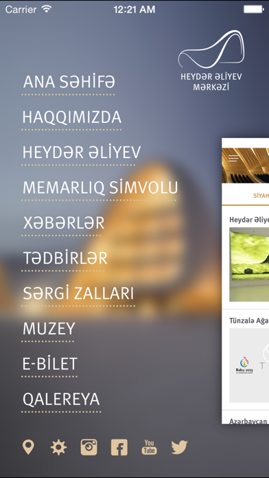
Sampled from 5 of Heydar Aliyev Center's App Store screenshots — background, accent and theme, measured by LaunchShots (not something Apple publishes).
#FCFCFC bg
#DDDDDD
#245C8C accent
#111111 text
- #1Muzey E-Bilet Qalereya О У f &
- #2bitirmisdir. Dovlat tahliikasizliyi organlarinda iyirmi bes il calisan Heydar ЭПуеу 1964-c
Captions read from the screenshots (OCR, may contain small errors): 2 headlines, 9 words on average (longest 11).
Screenshots



Icon palette
About this app
Heydәr Əliyev Mәrkәzinin mobil tәtbiqi. Bu tәtbiq vasitәsi ilә istifadәçilәr Azәrbaycan xalqının ümummilli lideri Heydәr Əliyevin hәyat vә fәaliyyәti, Heydәr Əliyev Mәrkәzi haqqında әtraflı mәlumat әldә edә, Mәrkәzlә bağlı әn son yeniliklәrdәn xәbәrdar ola bilәrlәr. Bundan әlavә mobil tәtbiq vasitәsi ilә Heydәr Əliyev Mәrkәzindә keçirilәn tәdbirlәr vә sәrgilәr haqqında mәlumat almaq olar. Hәmçinin mobil tәtbiqlә Mәrkәzdәki sәrgi vә konsertlәrә online bilet almaq mümkündür. Mobile application of the Heydar Aliyev Center This application allows users to learn about the national leader of Azerbaijan Heydar Aliyev’s life and activities, get detailed information about the Heydar Aliyev Center and be aware of the latest news related to the Center. In addition users will be able to be informed about events and exhibitions held at the Heydar Aliyev Center. The application also allows t…
App details
What you can learn from Heydar Aliyev Center
Every shipping app on the App Store has gone through the same decisions you're working through right now: which screenshot goes first, what caption sits over it, which device frame to show, what color the background should be. The 5 screenshots above are Heydar Aliyev Center's answers to those questions — they're public, they're real, and they made it through Apple's review.
What the numbers say: Heydar Aliyev Center runs a mixed light-and-dark set where the background shifts from screenshot to screenshot (first shot #FCFCFC) — each image has to stand on its own, so the captions carry more of the story. The accent colour we picked up, #245C8C, is the one to reuse for badges, arrows and highlighted words if you borrow this look. Hit Use this style to open the editor with these exact colours and drop your own screenshot in.
Notice the first screenshot in particular. It's the one users see in search results and on the product page, and it's where most apps spend their best caption and tightest design. Look at the proportion of background to phone, where the text sits, what one thing the image is trying to communicate.
Want to see how other News apps approach the same problem? Browse more News apps in the showcase.
Take what works into your own screenshots
Open LaunchShots and design your App Store & Google Play screenshots — pick a device frame, drop captions, ship in minutes. Free, in your browser.
Open the screenshot editor →Apps with a similar look
Closest background + accent colours among the listings we've analysed — useful when you want to see the same palette handled by a different team.