Chart position — tracked daily by LaunchShots
Screenshot style breakdown
Sampled from 5 of Pismo Święte z komentarzem's App Store screenshots — background, accent and theme, measured by LaunchShots (not something Apple publishes).
#B41C14 bg
#BE3B34
#044464 accent
#FFFFFF text
Screenshots
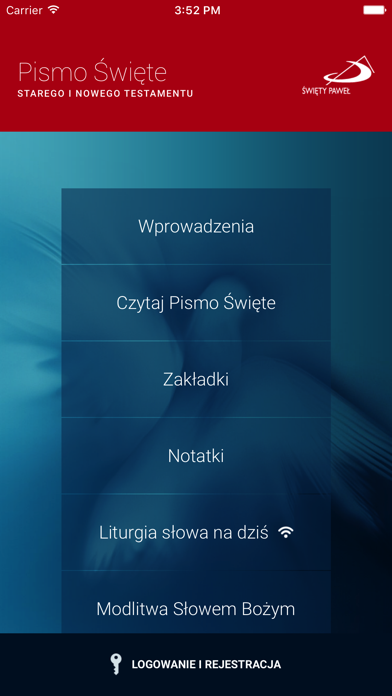
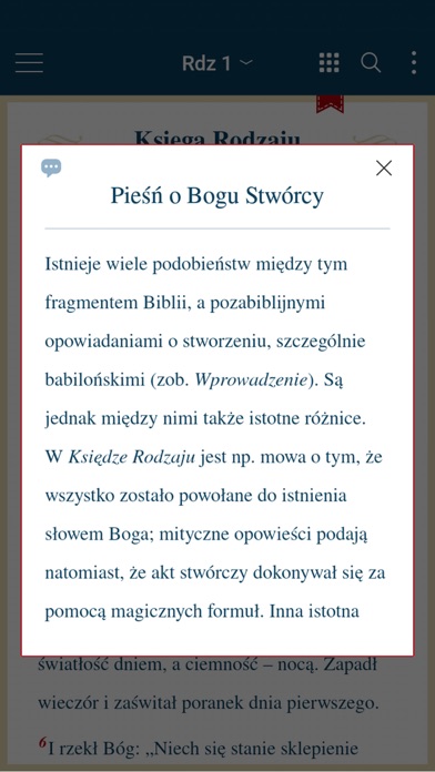
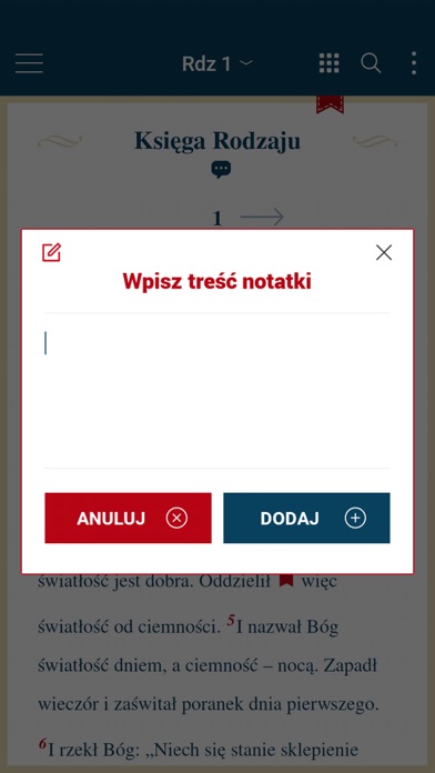
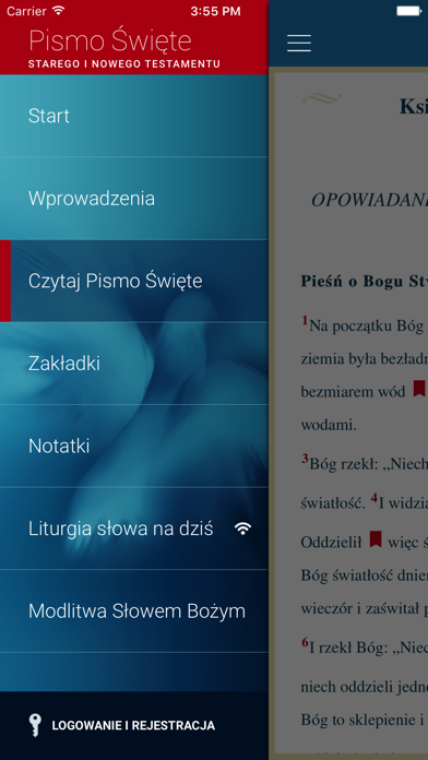
iPad screenshots



Icon palette
About this app
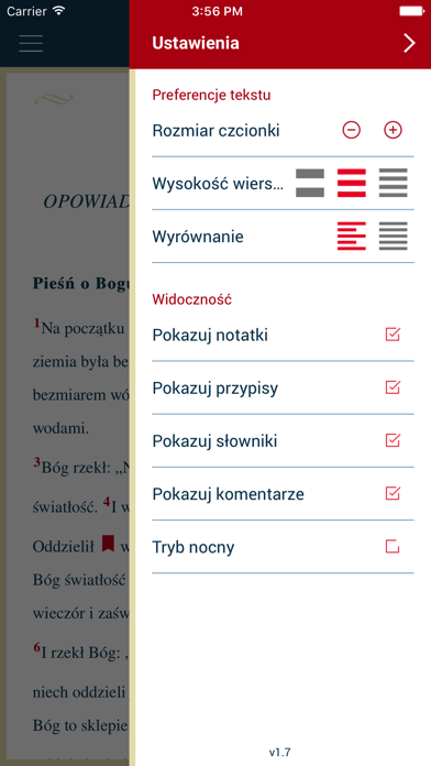
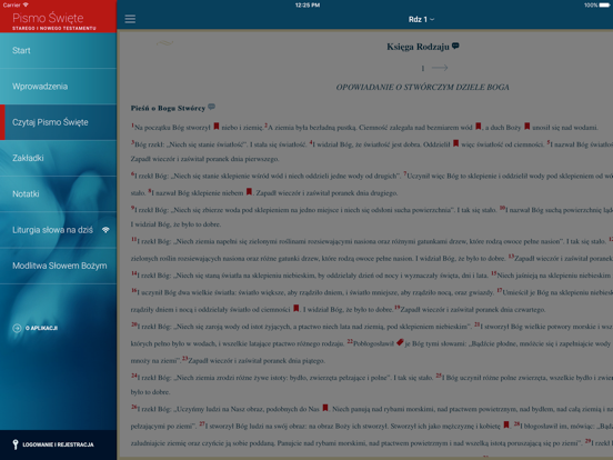
Przekazujemy w Twoje ręce Aplikację Pismo Święte z najnowszym przekładem Pisma Świętego z komentarzem opracowanym przez Zespół Biblistów Polskich z inicjatywy Towarzystwa Świętego Pawła. Aplikacja Pismo Święte - pierwsza Aplikacja z komentarzem i najnowszym przekładem w trzecim tysiącleciu. Idea i cechy najnowszego przekładu Pisma Świętego: • Maksymalna wierność tekstowi oryginalnemu, z uwzględnieniem w tłumaczeniu zasad współczesnego literackiego języka polskiego. • Dbałość o to, aby jak najlepiej oddać po polsku sens oryginalnego tekstu biblijnego. • Uwzględnienie w tłumaczeniu i komentarzach do tekstu biblijnego współczesnych badań nad Pismem Świętym. • Unikanie w przypisach i komentarzach specjalistycznego języka teologicznego. • Umieszczenie przed każdą księgą, a także przed zbiorami ksiąg (np. Ewangelie) zwięzłych wprowadzeń, pozwalających czytelnikowi uchwycić kontekst powstania…
App details
What you can learn from Pismo Święte z komentarzem
Every shipping app on the App Store has gone through the same decisions you're working through right now: which screenshot goes first, what caption sits over it, which device frame to show, what color the background should be. The 10 screenshots above are Pismo Święte z komentarzem's answers to those questions — they're public, they're real, and they made it through Apple's review.
What the numbers say: Pismo Święte z komentarzem runs a mixed light-and-dark set where the background shifts from screenshot to screenshot (first shot #B41C14) — each image has to stand on its own, so the captions carry more of the story. The accent colour we picked up, #044464, is the one to reuse for badges, arrows and highlighted words if you borrow this look. Hit Use this style to open the editor with these exact colours and drop your own screenshot in.
Notice the first screenshot in particular. It's the one users see in search results and on the product page, and it's where most apps spend their best caption and tightest design. Look at the proportion of background to phone, where the text sits, what one thing the image is trying to communicate.
Want to see how other Book apps approach the same problem? Browse more Book apps in the showcase.
Take what works into your own screenshots
Open LaunchShots and design your App Store & Google Play screenshots — pick a device frame, drop captions, ship in minutes. Free, in your browser.
Open the screenshot editor →Apps with a similar look
Closest background + accent colours among the listings we've analysed — useful when you want to see the same palette handled by a different team.