Chart position — tracked daily by LaunchShots
Screenshot style breakdown
Sampled from 6 of Pilz Erkenner - Auto Erkennung's App Store screenshots — background, accent and theme, measured by LaunchShots (not something Apple publishes).
#5CACCC bg
#5097B3
#14549C accent
#111111 text
Screenshots
iPad screenshots

Icon palette
About this app
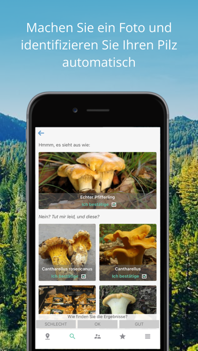
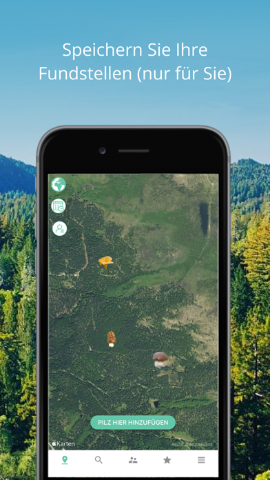
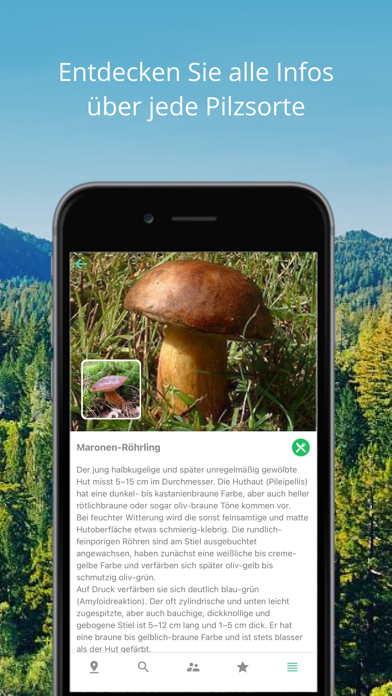
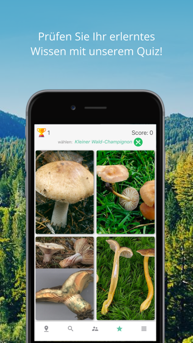
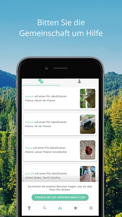
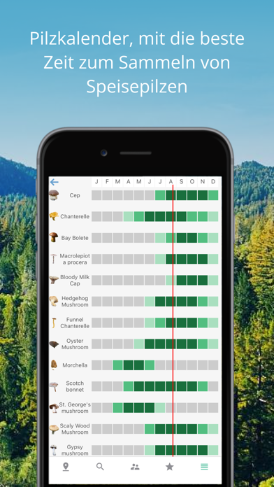
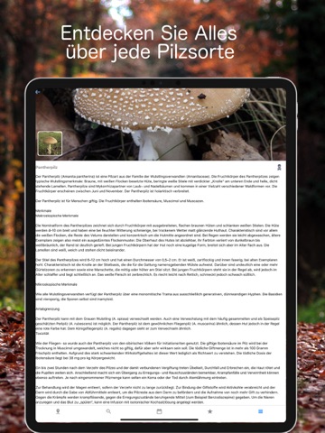
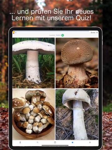
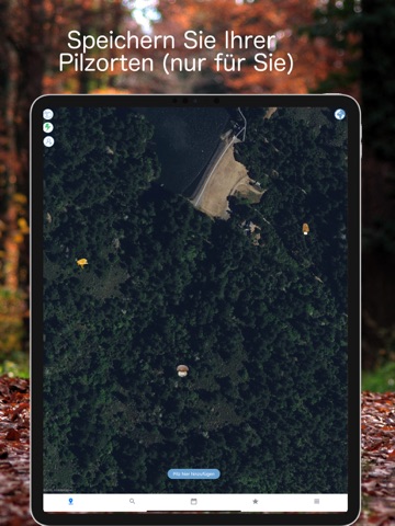
Automatische Identifizierung! Machen Sie einfach ein Foto, und lassen Sie Ihren Pilz automatisch identifizieren. Speichern Sie Ihre Fundstellen auf einer Karte (private Karte). Jetzt mit einem Spiel, so dass Sie alle Pilzarten erlernen können! Dies ist ein automatisch verlängerbares Abonnement. Nach Bestätigung wird Ihr iTunes-Konto mit der Zahlung belastet. Das Abonnement wird erneuert, es sei denn, es wird mindestens 24 Stunden vor Ablauf des Zeitraums beendet. Ihr Konto wird auch für die Verlängerung belastet. Sie können es in Ihren Kontoeinstellungen deaktivieren. Jeder nicht genutzte Teil eines kostenlosen Testzeitraums, falls angeboten, verfällt, wenn der Nutzer ein Abonnement für diese Publikation kauft, sofern zutreffend. Abonnement kündigen Sie können die automatische Verlängerung für das Abonnement jederzeit über iTunes deaktivieren https://support.apple.com/HT202039. Wenn…
App details
What you can learn from Pilz Erkenner - Auto Erkennung
Every shipping app on the App Store has gone through the same decisions you're working through right now: which screenshot goes first, what caption sits over it, which device frame to show, what color the background should be. The 10 screenshots above are Pilz Erkenner - Auto Erkennung's answers to those questions — they're public, they're real, and they made it through Apple's review.
What the numbers say: Pilz Erkenner - Auto Erkennung runs a light set where the background shifts from screenshot to screenshot (first shot #5CACCC) — each image has to stand on its own, so the captions carry more of the story. The accent colour we picked up, #14549C, is the one to reuse for badges, arrows and highlighted words if you borrow this look. Hit Use this style to open the editor with these exact colours and drop your own screenshot in.
Notice the first screenshot in particular. It's the one users see in search results and on the product page, and it's where most apps spend their best caption and tightest design. Look at the proportion of background to phone, where the text sits, what one thing the image is trying to communicate.
Want to see how other Education apps approach the same problem? Browse more Education apps in the showcase.
Take what works into your own screenshots
Open LaunchShots and design your App Store & Google Play screenshots — pick a device frame, drop captions, ship in minutes. Free, in your browser.
Open the screenshot editor →Apps with a similar look
Closest background + accent colours among the listings we've analysed — useful when you want to see the same palette handled by a different team.