Chart position — tracked daily by LaunchShots
Screenshot style breakdown
Sampled from 5 of Państwa Miasta's App Store screenshots — background, accent and theme, measured by LaunchShots (not something Apple publishes).
#0CC4EC bg
#0AACCF
#1C4C94 accent
#111111 text
Screenshots

iPad screenshots

Icon palette
About this app
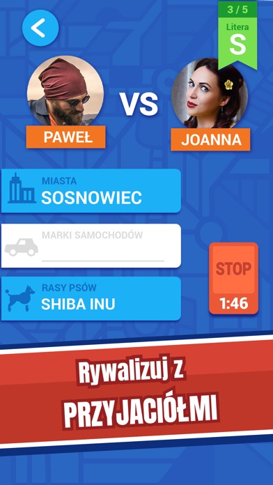
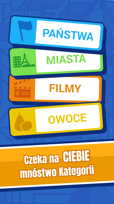
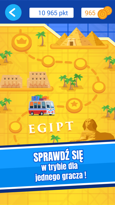
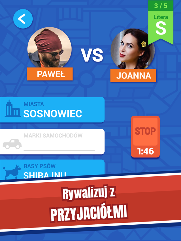
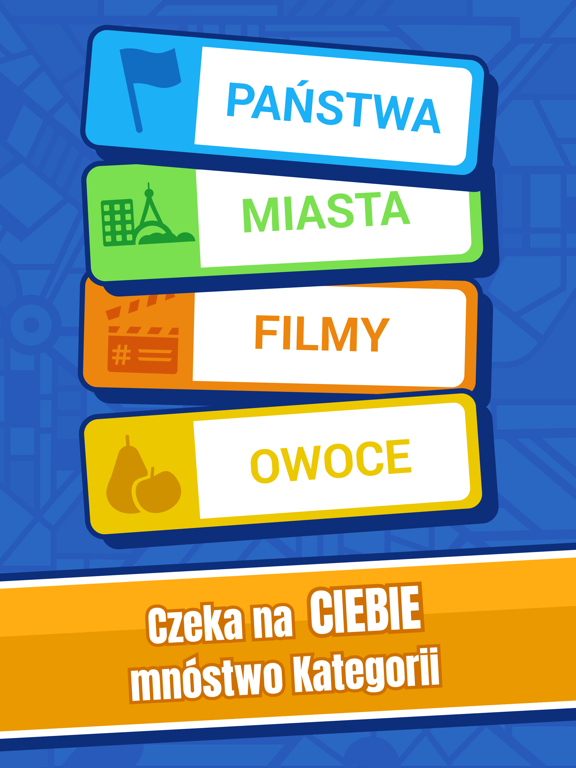
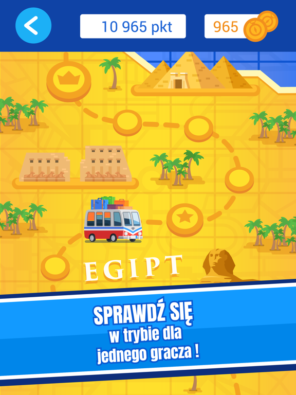
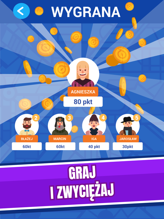
Państwo i miasto na F zapewne znasz. A dinozaura, albo klub piłkarski? Zagraj w legendarną grę, od pokoleń umilającą czas znudzonym uczniom, którym zbrzydła szkoła, uziemionym w domu na czas ferii rodzeństwom, studentom na salach wykładowych, a także prawdopodobnie każdemu kogo poznałeś. Od teraz możesz zapomnieć o organizowaniu stosów papieru, tuzina długopisów, rysowaniu rozbudowanych tabel i podliczaniu punktów. Wszystko zrobi za Ciebie nasza aplikacja! Słowa musisz zgadywać w ponad 30 kategoriach, które dzięki waszej pomocy ciągle będziemy ulepszać! Są wśród nich zarówno typowe dziedziny jak nazwy państw, miast, rzek, czy stolic, jak i tytuły filmów, seriali oraz gier. Zdobywaj punkty i monety, które możesz wykorzystać na podpowiedzi w kryzysowych momentach. Przemierzaj kolejne kraje zmagając się z różnej klasy przeciwnikami, odkrywaj lokalne zabytki i poszukuj inspiracji do kol…
App details
What you can learn from Państwa Miasta
Every shipping app on the App Store has gone through the same decisions you're working through right now: which screenshot goes first, what caption sits over it, which device frame to show, what color the background should be. The 10 screenshots above are Państwa Miasta's answers to those questions — they're public, they're real, and they made it through Apple's review.
What the numbers say: Państwa Miasta runs a mixed light-and-dark set where the background shifts from screenshot to screenshot (first shot #0CC4EC) — each image has to stand on its own, so the captions carry more of the story. The accent colour we picked up, #1C4C94, is the one to reuse for badges, arrows and highlighted words if you borrow this look. Hit Use this style to open the editor with these exact colours and drop your own screenshot in.
Notice the first screenshot in particular. It's the one users see in search results and on the product page, and it's where most apps spend their best caption and tightest design. Look at the proportion of background to phone, where the text sits, what one thing the image is trying to communicate.
Want to see how other Entertainment apps approach the same problem? Browse more Entertainment apps in the showcase.
Take what works into your own screenshots
Open LaunchShots and design your App Store & Google Play screenshots — pick a device frame, drop captions, ship in minutes. Free, in your browser.
Open the screenshot editor →Apps with a similar look
Closest background + accent colours among the listings we've analysed — useful when you want to see the same palette handled by a different team.