Chart position — tracked daily by LaunchShots
Screenshot style breakdown
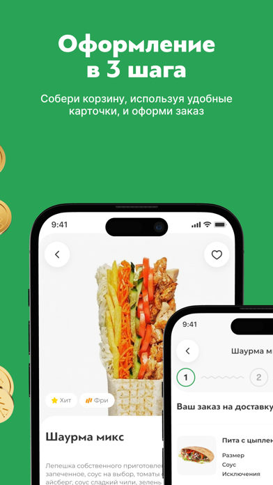
Sampled from 6 of Гриль №1: доставка еды's App Store screenshots — background, accent and theme, measured by LaunchShots (not something Apple publishes).
#2CA454 bg
#49B06B
#84CC9C accent
#FFFFFF text
Screenshots
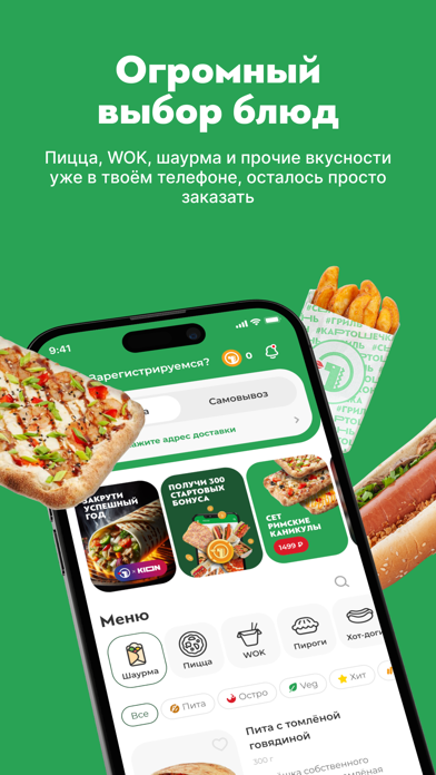
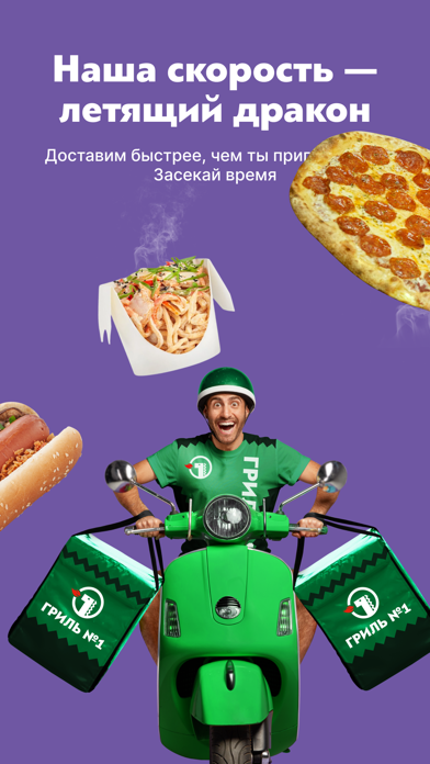
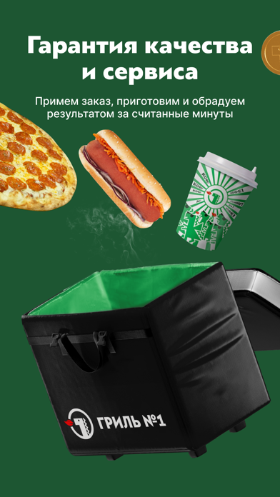
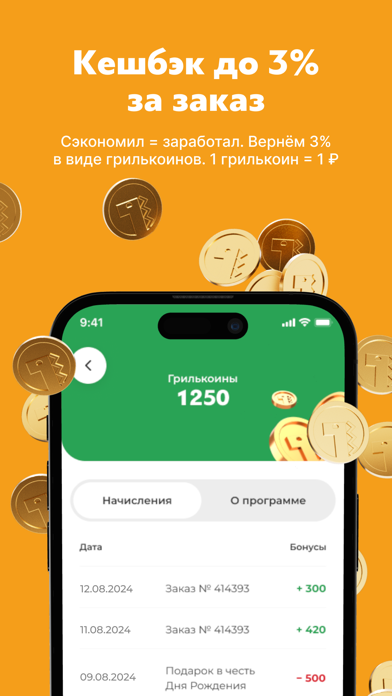

iPad screenshots


Icon palette
About this app
ВОЗМОЖНОСТИ — Заказывай вкусную еду в несколько кликов — Оформляй заказ без очереди — Меняй рецепт на свой вкус — Узнавай об актуальных акциях и предложениях — Копи и списывай бонусы — Плати любым удобным способом — Просматривай историю своих заказов — Пробуй новинки первым Установи приложение и получи мгновенный доступ к самому полному и актуальному меню с фотографиями, выбери понравившиеся блюда, укажи любой удобный способ доставки и оплаты, и мы с радостью приготовим твой заказ. АКЦИИ Ежедневные акции, кешбэк до 3% в рамках программы лояльности, пицца в день рождение, комбо, сеты пицц, пицца за наклейку на авто, регулярно обновляемый календарь выгодных акций на каждый день. ГОРОДА Барнаул, Бердск, Бийск, Горно-Алтайск, Екатеринбург, Искитим, Казань, Кемерово, Киселевск, Междуреченск, Новокузнецк, Новосибирск, Пенза, Прокопьевск, Рубцовск, Тюмень. РАДЫ ПРЕДЛОЖИТЬ — Круглая пицца и…
App details
What you can learn from Гриль №1: доставка еды
Every shipping app on the App Store has gone through the same decisions you're working through right now: which screenshot goes first, what caption sits over it, which device frame to show, what color the background should be. The 12 screenshots above are Гриль №1: доставка еды's answers to those questions — they're public, they're real, and they made it through Apple's review.
What the numbers say: Гриль №1: доставка еды runs a mixed light-and-dark set where the background shifts from screenshot to screenshot (first shot #2CA454) — each image has to stand on its own, so the captions carry more of the story. The accent colour we picked up, #84CC9C, is the one to reuse for badges, arrows and highlighted words if you borrow this look. Hit Use this style to open the editor with these exact colours and drop your own screenshot in.
Notice the first screenshot in particular. It's the one users see in search results and on the product page, and it's where most apps spend their best caption and tightest design. Look at the proportion of background to phone, where the text sits, what one thing the image is trying to communicate.
Want to see how other Food & Drink apps approach the same problem? Browse more Food & Drink apps in the showcase.
Take what works into your own screenshots
Open LaunchShots and design your App Store & Google Play screenshots — pick a device frame, drop captions, ship in minutes. Free, in your browser.
Open the screenshot editor →Apps with a similar look
Closest background + accent colours among the listings we've analysed — useful when you want to see the same palette handled by a different team.