Chart position — tracked daily by LaunchShots
Screenshot style breakdown
Sampled from 5 of 神奈川新聞 電子版(紙面ビューア)'s App Store screenshots — background, accent and theme, measured by LaunchShots (not something Apple publishes).
#2C2C2C bg
#494949
#045CAC accent
#FFFFFF text
Reading the caption text from the screenshots in your browser…
Screenshots


iPad screenshots


Icon palette
About this app
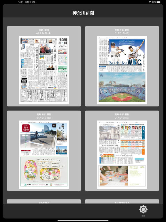
地域情報たっぷりの神奈川新聞の紙面を高精細な表示でご覧いただけます。 アプリのダウンロードは無料ですが、ご利用には神奈川新聞のニュースサイト「カナロコ」で、有料の「+電子版」コース、「新聞併読」コースに登録したIDが必要です。 ・過去90日分の紙面を読むことができます。 ・「検索」して記事を探すことができます。 ・「お気に入り」の記事を保存することができます。 ・「記事の共有」で気になる記事を共有できます。 ・「マイワード登録」でキーワードが含まれる記事がハイライトされます。 ・「テキスト表示」で記事を横書きで読むことができます。 ・事前に紙面をダウンロードすればいつでも読むことができます。 ※記事の共有は共有先の方も「+電子版」コース、「新聞併読」コースの登録が必要です。 ※お気に入り保存や検索などの対象記事について、一部対象外の記事がございます。 ※Wi-Fi環境でのご利用を推奨いたします。
App details
What you can learn from 神奈川新聞 電子版(紙面ビューア)
Every shipping app on the App Store has gone through the same decisions you're working through right now: which screenshot goes first, what caption sits over it, which device frame to show, what color the background should be. The 10 screenshots above are 神奈川新聞 電子版(紙面ビューア)'s answers to those questions — they're public, they're real, and they made it through Apple's review.
What the numbers say: 神奈川新聞 電子版(紙面ビューア) runs a mixed light-and-dark set where the background shifts from screenshot to screenshot (first shot #2C2C2C) — each image has to stand on its own, so the captions carry more of the story. The accent colour we picked up, #045CAC, is the one to reuse for badges, arrows and highlighted words if you borrow this look. Hit Use this style to open the editor with these exact colours and drop your own screenshot in.
Notice the first screenshot in particular. It's the one users see in search results and on the product page, and it's where most apps spend their best caption and tightest design. Look at the proportion of background to phone, where the text sits, what one thing the image is trying to communicate.
Want to see how other News apps approach the same problem? Browse more News apps in the showcase.
Take what works into your own screenshots
Open LaunchShots and design your App Store & Google Play screenshots — pick a device frame, drop captions, ship in minutes. Free, in your browser.
Open the screenshot editor →Apps with a similar look
Closest background + accent colours among the listings we've analysed — useful when you want to see the same palette handled by a different team.