Chart position — tracked daily by LaunchShots
Screenshot style breakdown
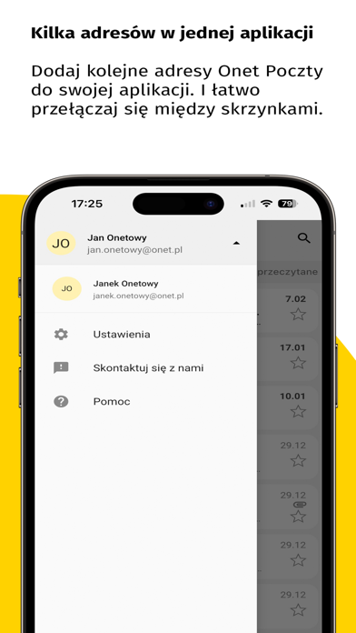
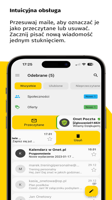
Sampled from 6 of Onet Poczta's App Store screenshots — background, accent and theme, measured by LaunchShots (not something Apple publishes).
#FCFCFC bg
#DDDDDD
#FCD404 accent
#111111 text
Screenshots
Icon palette
About this app
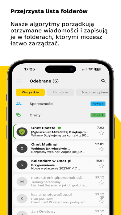
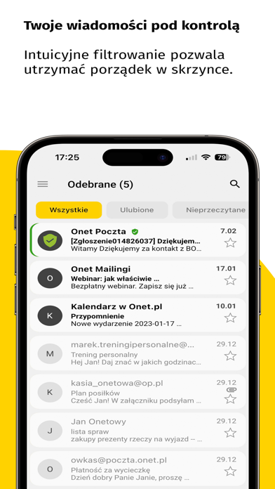
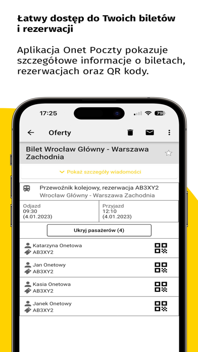
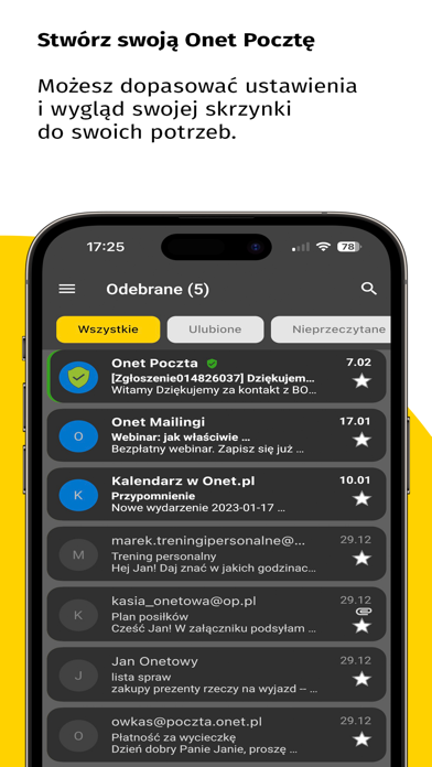
Onet Poczta – bezpłatna i wygodna aplikacja e-mail Teraz możesz cieszyć się rozwiązaniami, które są dostępne tylko w Onet Poczcie i wspierają Twoje zakupy online: szybkim dostępem do kuponów rabatowych, cashbackiem i folderem do porządkowania newsletterów. Z nowych funkcji może korzystać każdy. Wystarczy włączyć inteligentne funkcje oraz podawać swój adres email w Onet Poczcie, robiąc zakupy w sklepach internetowych lub zapisując się na newslettery ulubionych sklepów. Dlaczego jeszcze warto pobrać naszą aplikację? Bezpieczeństwo: Twoje maile są chronione przez zaawansowane filtry antyspamowe. Prosta nawigacja: Czy chcesz łatwo znaleźć, oznaczyć maila, czy szybko go napisać – aplikacja Onet Poczty pozwoli Ci zarządzać wiadomościami w prosty i zorganizowany sposób. Powiadomienia push: Ustaw powiadomienia o nowej wiadomości przychodzącej i bądź zawsze na bieżąco. Filtruj ma…
App details
What you can learn from Onet Poczta
Every shipping app on the App Store has gone through the same decisions you're working through right now: which screenshot goes first, what caption sits over it, which device frame to show, what color the background should be. The 6 screenshots above are Onet Poczta's answers to those questions — they're public, they're real, and they made it through Apple's review.
What the numbers say: Onet Poczta runs a light set with one background colour (#FCFCFC) carried across every screenshot — the listing reads as a single poster when the shots sit side by side in search results. The accent colour we picked up, #FCD404, is the one to reuse for badges, arrows and highlighted words if you borrow this look. Hit Use this style to open the editor with these exact colours and drop your own screenshot in.
Notice the first screenshot in particular. It's the one users see in search results and on the product page, and it's where most apps spend their best caption and tightest design. Look at the proportion of background to phone, where the text sits, what one thing the image is trying to communicate.
Want to see how other Productivity apps approach the same problem? Browse more Productivity apps in the showcase.
Take what works into your own screenshots
Open LaunchShots and design your App Store & Google Play screenshots — pick a device frame, drop captions, ship in minutes. Free, in your browser.
Open the screenshot editor →Apps with a similar look
Closest background + accent colours among the listings we've analysed — useful when you want to see the same palette handled by a different team.