Chart position — tracked daily by LaunchShots
Screenshot changes — detected by LaunchShots
Screenshot style breakdown
Sampled from 6 of Doping Hafıza's App Store screenshots — background, accent and theme, measured by LaunchShots (not something Apple publishes).
#E4F4FC bg
#C8D6DD
#E4A484 accent
#111111 text
- #1Türkiye'nin En Büyük Dijital Öğrenme Platformu
- #2Yapay zeka desteği ile başarıya ulaşmak artık daha kolay!
- #3Yapay zeka destekli kigisellestiriimis ders çalışma programı ile başarını artır! € Çalışma
- #5Ders içeriklerini tüketerek puan kazan ve sınıfındaki binlerce öğrenci arasında kendini zi
- #6Q Unite, konu ya da ders ara. Bugünün Konuları
Captions read from the screenshots (OCR, may contain small errors): 5 headlines, 9.6 words on average (longest 12).
Screenshots


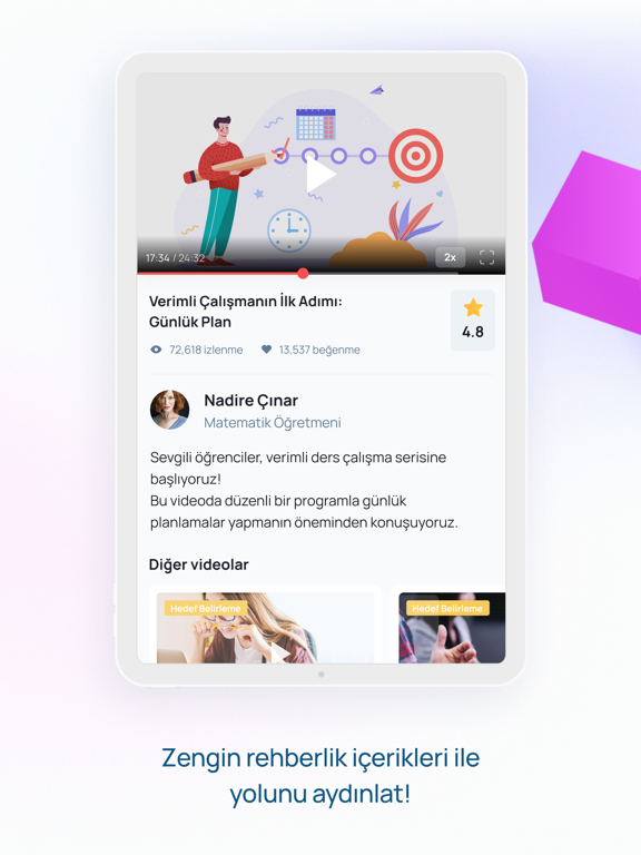
iPad screenshots




Icon palette
About this app
DOPİNG HAFIZA: YAPAY ZEKA DESTEKLİ TÜRKİYE’NİN EN BÜYÜK DİJİTAL EĞİTİM PLATFORMU KİMLER İÇİN? -1. sınıftan 12. sınıfa kadar tüm kullanıcılar -YKS'ye hazırlanan adaylar -LGS'ye hazırlanan kullanıcılar -KPSS, DGS ve ALES adayları -Yabancı dil öğrenmek isteyenler NEDEN DOPİNG HAFIZA? -“Dopi” ile yapay zeka destekli, kişiselleştirilmiş öğrenme deneyimi -Birebir özel rehberlik ve koçluk desteği -Branş uzmanlarından ekspres birebir görüşme imkânı -7/24 her yerden erişim KULLANICILARI NELER BEKLİYOR? -Günlük çalışma süresine göre hazırlanan ders programları -Refleksler, İnfografikler, Akıl Haritaları, Serüvenler, Hafıza Teknikleri gibi farklı anlatım türleriyle kişiselleştirilmiş öğrenim patikası -Binlerce soru ve video çözümü -Her soruya ait açıklayıcı çözüm videosu -Video ardı sorular ile öğrenme pekiştirme -Akıllı testlerle eksik kazanımlara yönelik gelişim -Deneme sınavl…
App details
What you can learn from Doping Hafıza
Every shipping app on the App Store has gone through the same decisions you're working through right now: which screenshot goes first, what caption sits over it, which device frame to show, what color the background should be. The 14 screenshots above are Doping Hafıza's answers to those questions — they're public, they're real, and they made it through Apple's review.
What the numbers say: Doping Hafıza runs a light set with one background colour (#E4F4FC) carried across every screenshot — the listing reads as a single poster when the shots sit side by side in search results. The accent colour we picked up, #E4A484, is the one to reuse for badges, arrows and highlighted words if you borrow this look. Hit Use this style to open the editor with these exact colours and drop your own screenshot in.
Notice the first screenshot in particular. It's the one users see in search results and on the product page, and it's where most apps spend their best caption and tightest design. Look at the proportion of background to phone, where the text sits, what one thing the image is trying to communicate.
Want to see how other Education apps approach the same problem? Browse more Education apps in the showcase.
Take what works into your own screenshots
Open LaunchShots and design your App Store & Google Play screenshots — pick a device frame, drop captions, ship in minutes. Free, in your browser.
Open the screenshot editor →Apps with a similar look
Closest background + accent colours among the listings we've analysed — useful when you want to see the same palette handled by a different team.