Screenshots

Icon palette
About this app
Shopping with Oriflame has never been easier. With a reimagined design and with swift navigation patterns we hope to add further value for brand-new, as well as seasoned, Oriflame members. With a mix of established features and new exciting functionalities, like the new and improved digital eCatalogue, we hope that your experience with us will both be simpler and more enjoyable than ever before.
App details
What you can learn from Oriflame
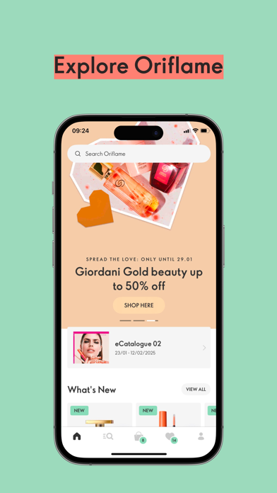
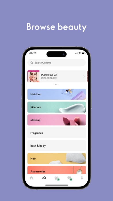
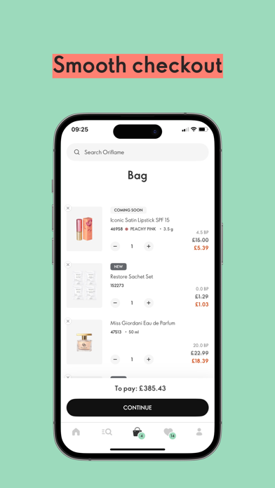
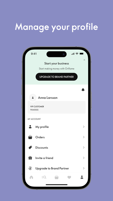
Every shipping app on the App Store has gone through the same decisions you're working through right now: which screenshot goes first, what caption sits over it, which device frame to show, what color the background should be. The 5 screenshots above are Oriflame's answers to those questions — they're public, they're real, and they made it through Apple's review.
Notice the first screenshot in particular. It's the one users see in search results and on the product page, and it's where most apps spend their best caption and tightest design. Look at the proportion of background to phone, where the text sits, what one thing the image is trying to communicate.
Want to see how other Shopping apps approach the same problem? Browse more Shopping apps in the showcase.
Take what works into your own screenshots
Open LaunchShots and design your App Store & Google Play screenshots — pick a device frame, drop captions, ship in minutes. Free, in your browser.
Open the screenshot editor →