Chart position — tracked daily by LaunchShots
Screenshot style breakdown
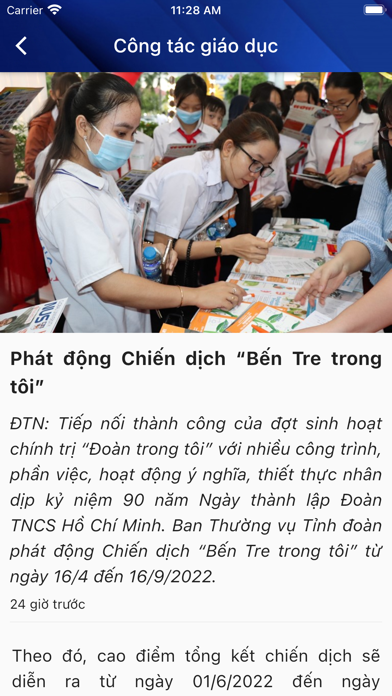
Sampled from 5 of Đoàn thanh niên's App Store screenshots — background, accent and theme, measured by LaunchShots (not something Apple publishes).
#FCFCFC bg
#DDDDDD
#0C2C7C accent
#111111 text
Screenshots


Icon palette
About this app
GIỚI THIỆU VỀ ĐOÀN TNCS HỒ CHÍ MINH Đoàn TNCS Hồ Chí Minh là tổ chức chính trị - xã hội của thanh niên Việt Nam do Đảng Cộng sản Việt Nam và Chủ tịch Hồ Chí Minh sáng lập, lãnh đạo và rèn luyện. Đoàn bao gồm những thanh niên tiên tiến, phấn đấu vì mục tiêu, lý tưởng của Đảng là độc lập dân tộc gắn liền với chủ nghĩa xã hội, dân giàu, nước mạnh, dân chủ, công bằng, văn minh. Đoàn TNCS Hồ Chí Minh là đội dự bị tin cậy của Đảng Cộng sản Việt Nam, là lực lượng xung kích cách mạng, là trường học xã hội chủ nghĩa của thanh niên, đại diện chăm lo và bảo vệ quyền lợi hợp pháp, chính đáng của tuổi trẻ; phụ trách Đội Thiếu niên Tiền phong Hồ Chí Minh; là lực lượng nòng cốt chính trị trong phong trào thanh niên và trong các tổ chức thanh niên Việt Nam. Đoàn TNCS Hồ Chí Minh là thành viên của hệ thống chính trị, hoạt động trong khuôn khổ Hiến pháp và Pháp luật của nước Cộng hòa Xã hội Chủ nghĩa V…
App details
What you can learn from Đoàn thanh niên
Every shipping app on the App Store has gone through the same decisions you're working through right now: which screenshot goes first, what caption sits over it, which device frame to show, what color the background should be. The 5 screenshots above are Đoàn thanh niên's answers to those questions — they're public, they're real, and they made it through Apple's review.
What the numbers say: Đoàn thanh niên runs a light set with one background colour (#FCFCFC) carried across every screenshot — the listing reads as a single poster when the shots sit side by side in search results. The accent colour we picked up, #0C2C7C, is the one to reuse for badges, arrows and highlighted words if you borrow this look. Hit Use this style to open the editor with these exact colours and drop your own screenshot in.
Notice the first screenshot in particular. It's the one users see in search results and on the product page, and it's where most apps spend their best caption and tightest design. Look at the proportion of background to phone, where the text sits, what one thing the image is trying to communicate.
Want to see how other News apps approach the same problem? Browse more News apps in the showcase.
Take what works into your own screenshots
Open LaunchShots and design your App Store & Google Play screenshots — pick a device frame, drop captions, ship in minutes. Free, in your browser.
Open the screenshot editor →Apps with a similar look
Closest background + accent colours among the listings we've analysed — useful when you want to see the same palette handled by a different team.