Chart position — tracked daily by LaunchShots
Screenshot style breakdown
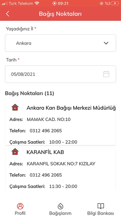
Sampled from 6 of Türk Kızılay Mobil Kan Bağışı's App Store screenshots — background, accent and theme, measured by LaunchShots (not something Apple publishes).
#F4F4F4 bg
#D6D6D6
#F44444 accent
#111111 text
Screenshots
Icon palette
About this app
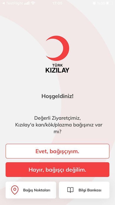
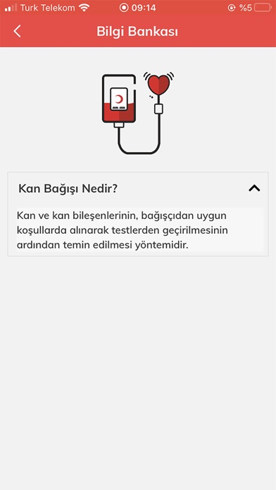
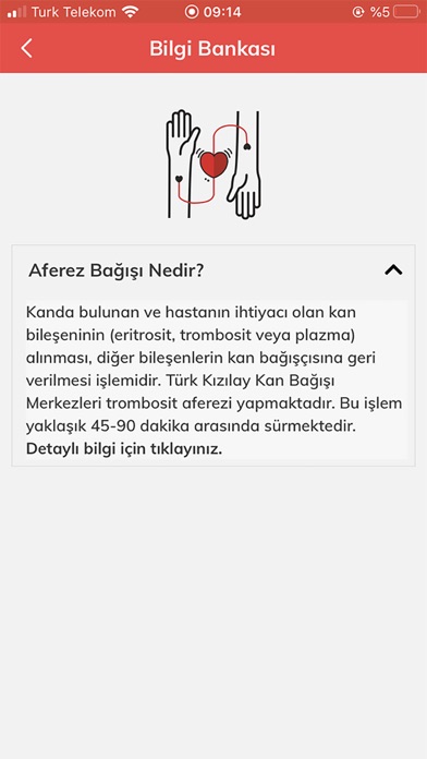
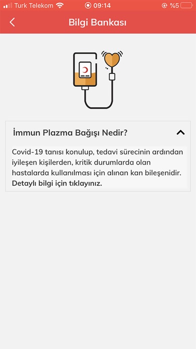
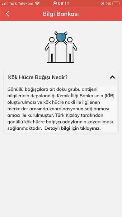
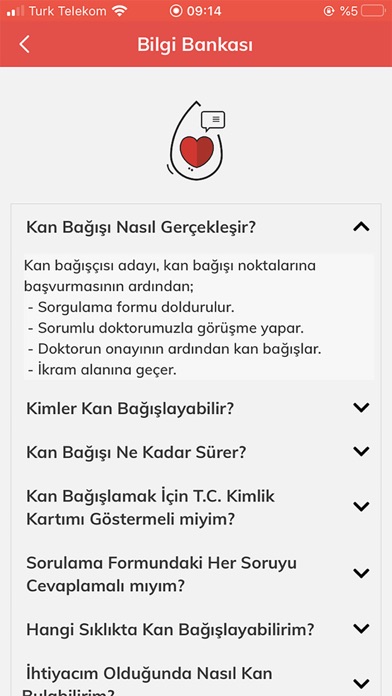
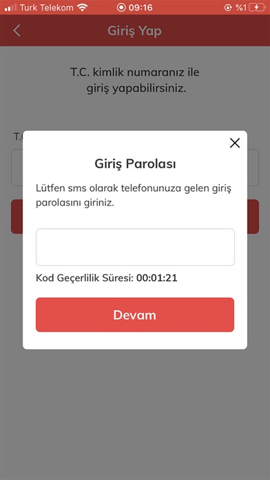
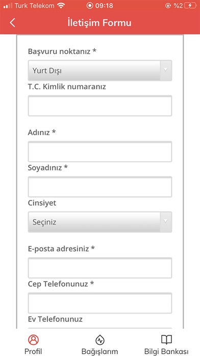
Türk Kızılay Mobil Kan Bağışı Uygulaması, kan ve kök hücre bağışçısı olan ve olmak isteyen herkese rehber oluyor. Kızılay Mobil Kan Bağışı Uygulamasında Neler Var? - Randevu Sistemi Kan bağış noktası, bağış türü, tarih ve saat seçimi ile randevu alınabiliyor. Aktif randevuları iptal edip tekrar randevu oluşturulabiliyor. Daha önce hiç kan bağışı yapılmamış olsa bile yeni bağışçı kaydı oluşturulabiliyor. - SMS doğrulaması ile uygulamaya giriş yapan kullanıcılar, bağışçı profil bilgilerinin güncellemesini, iletişim tercihleri seçimini yapabiliyor. Kan bağışçıları, geçmiş kan bağışı bilgilerini kontrol edebilirken, hak edilen madalyalara ilişkin de gerekli toplam bağış sayısı bilgilerini “Ödül Kriterleri” bölümünden görüntüleyebiliyor. - Türk Kızılay veri tabanında kayıtlı olan kan grubu bilgisini görüntüleyebilmekle beraber kan grubu belgesi tek tıkla mobil cihazlara indirilebiliyor. …
App details
What you can learn from Türk Kızılay Mobil Kan Bağışı
Every shipping app on the App Store has gone through the same decisions you're working through right now: which screenshot goes first, what caption sits over it, which device frame to show, what color the background should be. The 9 screenshots above are Türk Kızılay Mobil Kan Bağışı's answers to those questions — they're public, they're real, and they made it through Apple's review.
What the numbers say: Türk Kızılay Mobil Kan Bağışı runs a light set with one background colour (#F4F4F4) carried across every screenshot — the listing reads as a single poster when the shots sit side by side in search results. The accent colour we picked up, #F44444, is the one to reuse for badges, arrows and highlighted words if you borrow this look. Hit Use this style to open the editor with these exact colours and drop your own screenshot in.
Notice the first screenshot in particular. It's the one users see in search results and on the product page, and it's where most apps spend their best caption and tightest design. Look at the proportion of background to phone, where the text sits, what one thing the image is trying to communicate.
Want to see how other Medical apps approach the same problem? Browse more Medical apps in the showcase.
Take what works into your own screenshots
Open LaunchShots and design your App Store & Google Play screenshots — pick a device frame, drop captions, ship in minutes. Free, in your browser.
Open the screenshot editor →Apps with a similar look
Closest background + accent colours among the listings we've analysed — useful when you want to see the same palette handled by a different team.