Screenshot style breakdown
Sampled from 5 of Webtic Prenotazioni Cinema's App Store screenshots — background, accent and theme, measured by LaunchShots (not something Apple publishes).
#343434 bg
#505050
#4C8CCC accent
#FFFFFF text
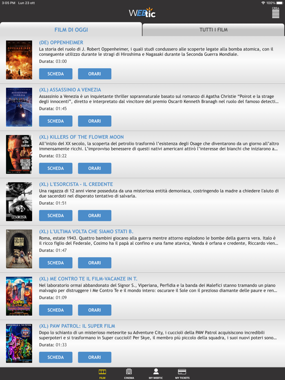
- #1Una ragazza di 12 anni viene posseduta da una misteriosa entità demoniaca, costringendo la
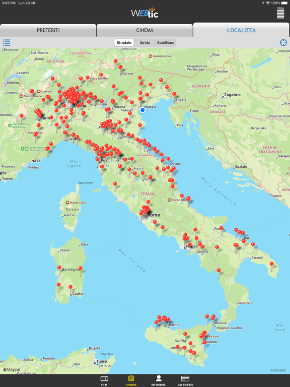
- #2e Constantine “Mappe Avvisi legali uns] 2 =
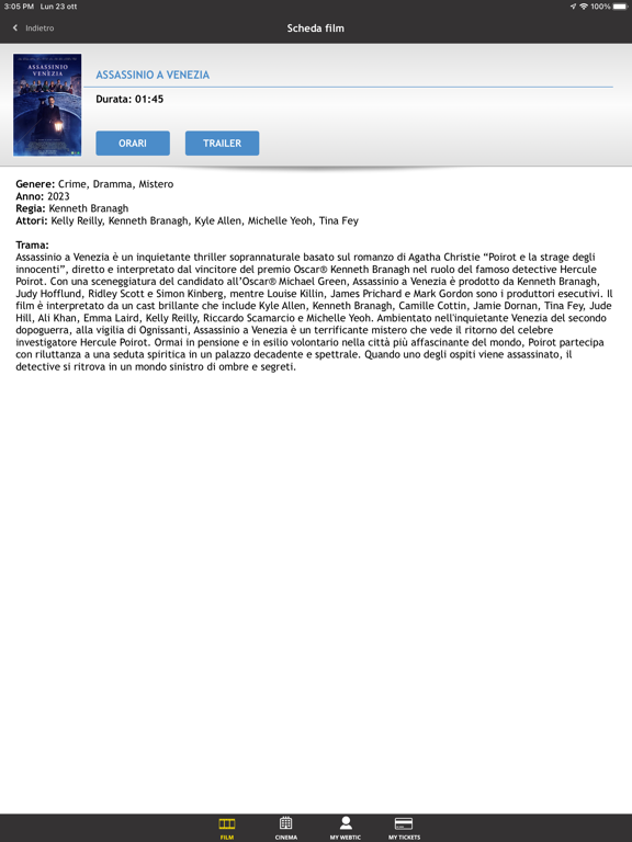
- #3Laird, Kelly Reilly, Riccardo Scamarcio e Michelle Yeoh. ‘Ambientato nell'inquietante Vene
- #4E 2 = CINEMA MY WEBTIC MY TICKETS
Captions read from the screenshots (OCR, may contain small errors): 4 headlines, 10.3 words on average (longest 14).
Screenshots
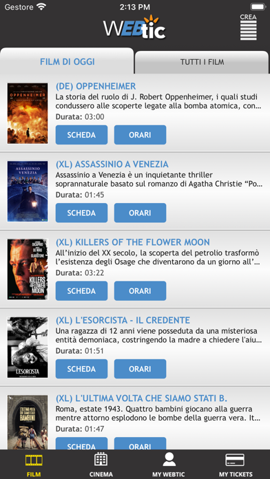
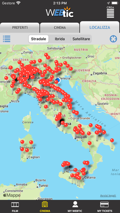
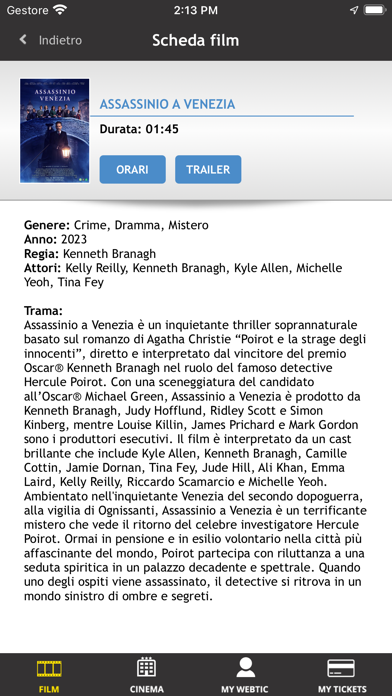

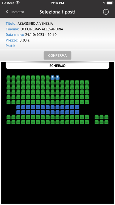
iPad screenshots


Icon palette
About this app
Webtic, il più diffuso sistema di prenotazione e acquisto on line, ideato e creato da Crea informatica srl, è ora disponibile anche per iPhone, iPod. e iPad. Grazie alla nostra applicazione è possibile prenotare e acquistare biglietti per moltissimi cinema in Italia … oltre 1.500 schermi a disposizione con informazioni sulla programmazione, gli orari, le locandine, gli attori , sinossi, trailer,ecc. Grazie alla connessione diretta ai sistemi di biglietteria Crea Wintic , presenti nei più prestigiosi circuiti cinematografici, potrete visualizzare la mappa dei posti con lo stato di occupazione in tempo reale e selezionare i posti da voi preferiti. Gli orari dei film saranno sempre aggiornati perché presi direttamente dai cinema. Per alcuni cinema il servizio di prenotazione e/o acquisto con carta di credito potrebbe essere disattivato perché non previsto dalla politica dell’eserci…
App details
What you can learn from Webtic Prenotazioni Cinema
Every shipping app on the App Store has gone through the same decisions you're working through right now: which screenshot goes first, what caption sits over it, which device frame to show, what color the background should be. The 10 screenshots above are Webtic Prenotazioni Cinema's answers to those questions — they're public, they're real, and they made it through Apple's review.
What the numbers say: Webtic Prenotazioni Cinema runs a dark set where the background shifts from screenshot to screenshot (first shot #343434) — each image has to stand on its own, so the captions carry more of the story. The accent colour we picked up, #4C8CCC, is the one to reuse for badges, arrows and highlighted words if you borrow this look. Hit Use this style to open the editor with these exact colours and drop your own screenshot in.
Notice the first screenshot in particular. It's the one users see in search results and on the product page, and it's where most apps spend their best caption and tightest design. Look at the proportion of background to phone, where the text sits, what one thing the image is trying to communicate.
Want to see how other Entertainment apps approach the same problem? Browse more Entertainment apps in the showcase.
Take what works into your own screenshots
Open LaunchShots and design your App Store & Google Play screenshots — pick a device frame, drop captions, ship in minutes. Free, in your browser.
Open the screenshot editor →Apps with a similar look
Closest background + accent colours among the listings we've analysed — useful when you want to see the same palette handled by a different team.