Chart position — tracked daily by LaunchShots
Screenshot style breakdown
Sampled from 5 of NOSTRA Map - GPS Navigation's App Store screenshots — background, accent and theme, measured by LaunchShots (not something Apple publishes).
#FCFCFC bg
#DDDDDD
#7CA4D4 accent
#111111 text
Reading the caption text from the screenshots in your browser…
Screenshots

iPad screenshots


Icon palette
About this app
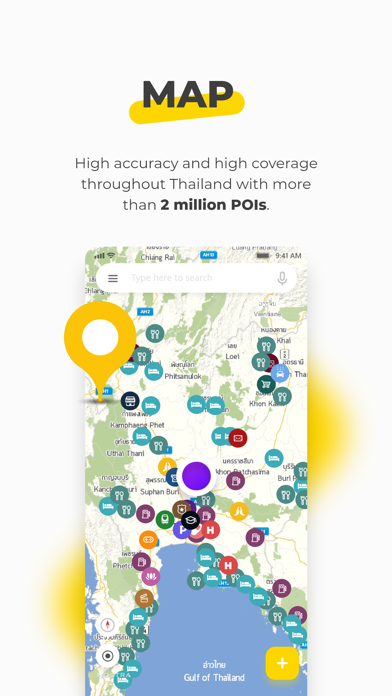
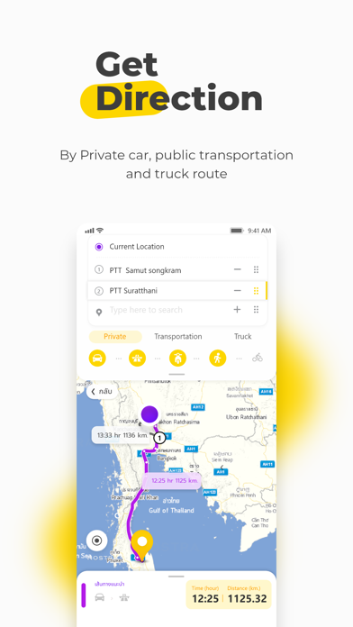
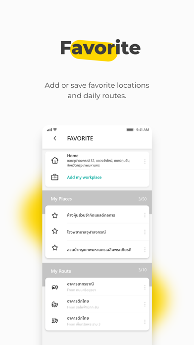
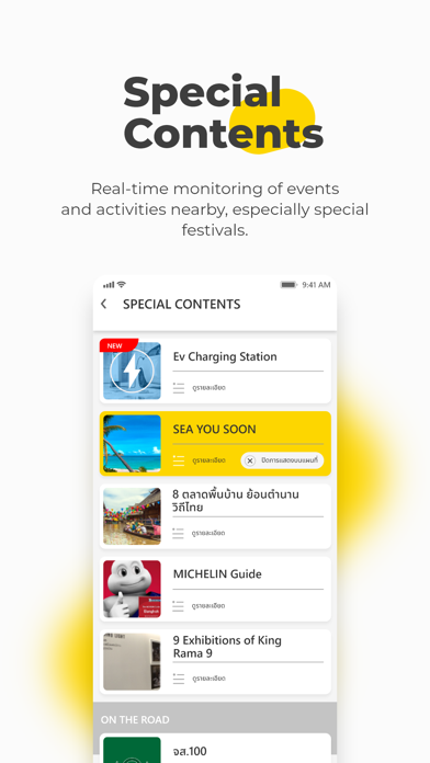
*** For English, please scroll down *** เที่ยวทั่วไทยไปกับ NOSTRA แผนที่ประเทศไทยที่ดีที่สุด อันดับหนึ่งในตลาดแผนที่ระบบเนวิเกเตอร์ ลงทะเบียนเพื่อใช้งานฟังก์ชั่นใหม่พร้อมอัพเดทข้อมูลแผนที่ที่ละเอียด แม่นยำสูงสุด ด้วยตำแหน่งสถานที่มากกว่า 1,500,000 จุด ทั่วประเทศ NOSTRA จะเป็นเพื่อนช่วยแนะนำร้านอาหาร ที่เที่ยว ที่ช้อปปิ้งได้ทั่วไทย พร้อมช่วยค้นหาสถานที่ เส้นทางการเดินทาง เก็บสถานที่สนใจไว้เป็น "สถานที่ใช้ประจำ" และสามารถแชร์ตำแหน่งสถานที่ของคุณให้เพื่อนๆ ได้ง่ายๆ พิเศษ! ให้คุณไม่พลาดกิจกรรมน่าสนใจด้วยชั้นข้อมูลพิเศษแนะนำสถานที่และกิจกรรมในเทศกาลสำคัญของประเทศไทย หลีกเลี่ยงเส้นทางรถติดด้วยรายงานข้อมูลสภาพจราจรทั่วกรุงเทพฯ และสนุกกับการขี่จักรยานด้วยเส้นทางจักรยานแนะนำโดยมูลนิธิโลกสีเขียว มีอะไรใหม่ใน NOSTRA Map v.5.0 1. ปรับ Design ทั้งแอปพลิเคชันเพื่อให้ทันสมัยและเพื่อให้ผู้ใช้บริการได้รับประสบการณ์ใหม่จากการใช้ NOSTRA Map Application เวอร์ชัน 5.0 2. อัพเกรด Map Engine เพื่อความเสถียร…
App details
What you can learn from NOSTRA Map - GPS Navigation
Every shipping app on the App Store has gone through the same decisions you're working through right now: which screenshot goes first, what caption sits over it, which device frame to show, what color the background should be. The 10 screenshots above are NOSTRA Map - GPS Navigation's answers to those questions — they're public, they're real, and they made it through Apple's review.
What the numbers say: NOSTRA Map - GPS Navigation runs a light set with one background colour (#FCFCFC) carried across every screenshot — the listing reads as a single poster when the shots sit side by side in search results. The accent colour we picked up, #7CA4D4, is the one to reuse for badges, arrows and highlighted words if you borrow this look. Hit Use this style to open the editor with these exact colours and drop your own screenshot in.
Notice the first screenshot in particular. It's the one users see in search results and on the product page, and it's where most apps spend their best caption and tightest design. Look at the proportion of background to phone, where the text sits, what one thing the image is trying to communicate.
Want to see how other Navigation apps approach the same problem? Browse more Navigation apps in the showcase.
Take what works into your own screenshots
Open LaunchShots and design your App Store & Google Play screenshots — pick a device frame, drop captions, ship in minutes. Free, in your browser.
Open the screenshot editor →Apps with a similar look
Closest background + accent colours among the listings we've analysed — useful when you want to see the same palette handled by a different team.