Screenshot style breakdown
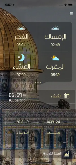
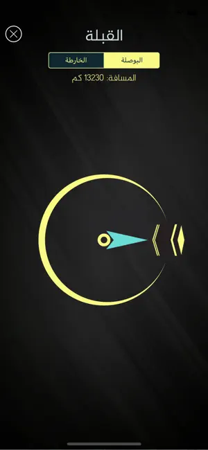
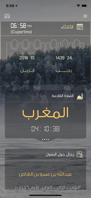
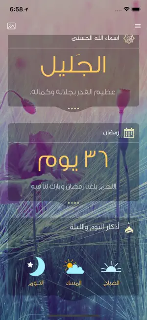
Sampled from 6 of صلاتي حياتي-الصلاة والقبلة's App Store screenshots — background, accent and theme, measured by LaunchShots (not something Apple publishes).
#340C1C bg
#502E3B
#64A4CC accent
#FFFFFF text
Screenshots

Icon palette
About this app
بحمد لله لأول مرة على اجهزة آيفون آببود وآيباد سنسمع الاذان كاملا عند كل صلاة دون الحاجة الى فتح التطبيق هذا التطبيق يعرض أوقات الصلاة، القبلة بوصلة الاتجاه، التاريخ الهجري، مواقيت منبه الصلاة، كل هذه الميزات في هذا التطبيق الرائع، حساب أوقات الصلاة بإستخدام نظام تحديد الموقع يقوم التطبيق بعرض أوقات الصلاة (الفجر، الشروق، الظهر، العصر، المغرب، العشاء) تستطيع اختيار المدينة يدويا من خلال صفحة البحث اذا كنت لا تريد ان تستخدم نظام تحديد المواقع بمجرد فتح التطبيق تجد شاشة عرض رائعة تعرض لك إتجاه القبلة واوقات الصلاة والوقت المتبقي للصلاة القادمة والتاريخ الهجري. خمس طرق لحساب اوقات الصلاة تعديل أوقات الصلاة بما يناسبك صور عالية الجودة تناسب شاشة الآيفون والايباد الريتينا تستطيع اختيار اي دولة واي مدينة في العالم لتقوم بحساب الصلاة منبه الصلاة عند كل موعد صلاة سيقوم الجهاز بالآذان بالصوت الذي اخترته من الاعدادات ملاحظةة: نرجو منكم العلم بان وقت الصلاة يحسب بناء علي…
App details
What you can learn from صلاتي حياتي-الصلاة والقبلة
Every shipping app on the App Store has gone through the same decisions you're working through right now: which screenshot goes first, what caption sits over it, which device frame to show, what color the background should be. The 6 screenshots above are صلاتي حياتي-الصلاة والقبلة's answers to those questions — they're public, they're real, and they made it through Apple's review.
What the numbers say: صلاتي حياتي-الصلاة والقبلة runs a mixed light-and-dark set where the background shifts from screenshot to screenshot (first shot #340C1C) — each image has to stand on its own, so the captions carry more of the story. The accent colour we picked up, #64A4CC, is the one to reuse for badges, arrows and highlighted words if you borrow this look. Hit Use this style to open the editor with these exact colours and drop your own screenshot in.
Notice the first screenshot in particular. It's the one users see in search results and on the product page, and it's where most apps spend their best caption and tightest design. Look at the proportion of background to phone, where the text sits, what one thing the image is trying to communicate.
Want to see how other Navigation apps approach the same problem? Browse more Navigation apps in the showcase.
Take what works into your own screenshots
Open LaunchShots and design your App Store & Google Play screenshots — pick a device frame, drop captions, ship in minutes. Free, in your browser.
Open the screenshot editor →Apps with a similar look
Closest background + accent colours among the listings we've analysed — useful when you want to see the same palette handled by a different team.