Chart position — tracked daily by LaunchShots
Screenshot style breakdown
Sampled from 3 of Enbek HR – еңбек шарттары's App Store screenshots — background, accent and theme, measured by LaunchShots (not something Apple publishes).
#14B47C bg
#119E6D
#6CD4AC accent
#111111 text
Screenshots

Icon palette
About this app
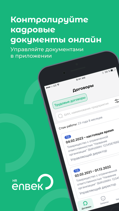
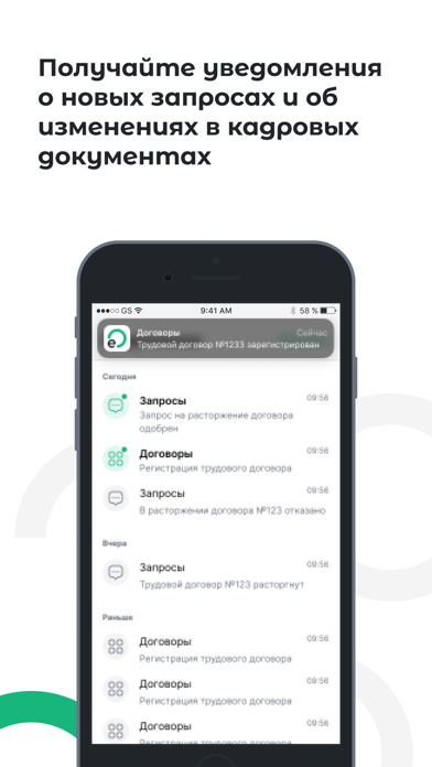
Enbek HR – еңбек шарттарын онлайн режимде басқару ENBEK HR – кадрлық құжаттармен онлайн жұмыс жүргізуге арналған қосымша. Қосымшада Сіз өзіңіздің еңбек шарттарыңызды қарап, жұмыс берушілердің жеке іс бойынша сұраныстарын қабылдай немесе кері қайтара аласыз, еңбек шарттарына қатысты деректерді түзету туралы өтінім жолдай аласыз, сондай-ақ жұмыс орнынан анықтама жүктей аласыз. Қазақстан Республикасында еңбек қызметін жүзеге асыратын азаматтар үшін Enbek қосымшасының артықшылықтары: Еңбек шарттарыңызға қатысты барлық ақпарат әрқашан қолжетімді.Жұмыс орнынан анықтаманы бірнеше қадамда жүктеп алу мүмкіндігі.Бұрын жасалған еңбек шарттарындағы деректерді түзетуге өтінім беру мүмкіндігі.Жұмыс берушілердің жеке ісіңізге қол жеткізу сұраныстарын басқару.Еңбек шарттарына енгізілген барлық өзгерістер бойынша хабарламаларды тікелей мобильді құрылғыдан алу.HR Enbek порталымен толық синхрондау. Қо…
App details
What you can learn from Enbek HR – еңбек шарттары
Every shipping app on the App Store has gone through the same decisions you're working through right now: which screenshot goes first, what caption sits over it, which device frame to show, what color the background should be. The 3 screenshots above are Enbek HR – еңбек шарттары's answers to those questions — they're public, they're real, and they made it through Apple's review.
What the numbers say: Enbek HR – еңбек шарттары runs a light set where the background shifts from screenshot to screenshot (first shot #14B47C) — each image has to stand on its own, so the captions carry more of the story. The accent colour we picked up, #6CD4AC, is the one to reuse for badges, arrows and highlighted words if you borrow this look. Hit Use this style to open the editor with these exact colours and drop your own screenshot in.
Notice the first screenshot in particular. It's the one users see in search results and on the product page, and it's where most apps spend their best caption and tightest design. Look at the proportion of background to phone, where the text sits, what one thing the image is trying to communicate.
Want to see how other News apps approach the same problem? Browse more News apps in the showcase.
Take what works into your own screenshots
Open LaunchShots and design your App Store & Google Play screenshots — pick a device frame, drop captions, ship in minutes. Free, in your browser.
Open the screenshot editor →Apps with a similar look
Closest background + accent colours among the listings we've analysed — useful when you want to see the same palette handled by a different team.