Chart position — tracked daily by LaunchShots
Screenshot changes — detected by LaunchShots
Screenshot style breakdown
Sampled from 6 of Son Düzlük - Ganyan At Yarışı's App Store screenshots — background, accent and theme, measured by LaunchShots (not something Apple publishes).
#040474 bg
#272787
#FC7C14 accent
#FFFFFF text
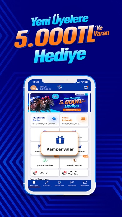
- #1Yeni Uyelere Hediye
- #3SABITIHTIMALLI
- #4SANS OYUNLARI
- #5SANAL _VARISLAR
- #6YAZAR ANALİZLERİ & KUPONLARI
Captions read from the screenshots (OCR, may contain small errors): 5 headlines, 2.4 words on average (longest 4), mostly ALL CAPS.
Screenshots


Icon palette
About this app
Son Düzlük: Yeni Nesil At Yarışı ve Ganyan Platformu Türkiye’de at yarışı heyecanını modern teknoloji ve Saran Group güvencesiyle cebinize taşıyoruz. Son Düzlük ile at yarışı oynama deneyimini pratik, hızlı ve kullanıcı dostu bir yapıya dönüştürün. Gelenekselleşmiş yarış tutkusunu yenilikçi altyapımızla birleştirerek şampiyonların adresinde yerinizi almanızı sağlıyoruz. At Yarışı Uzman Yorumları ve Güncel Yarış Analizleri Yarış öncesi daha bilinçli karar vermeniz için uzman yorumcu kadromuzun titizlikle hazırladığı güncel kuponlar ve detaylı yarış analizleri Son Düzlük’te sizi bekliyor. Atların form durumundan galop bilgilerine, pist koşullarından geçmiş performanslarına kadar birçok önemli veri kullanıcıların değerlendirmesine sunulur. Altılı ganyan heyecanını daha planlı yaşamak isteyenler için güncel tahminler, yarış yorumları ve kupon önerileri tek ekranda kolayca takip edilebili…
App details
What you can learn from Son Düzlük - Ganyan At Yarışı
Every shipping app on the App Store has gone through the same decisions you're working through right now: which screenshot goes first, what caption sits over it, which device frame to show, what color the background should be. The 6 screenshots above are Son Düzlük - Ganyan At Yarışı's answers to those questions — they're public, they're real, and they made it through Apple's review.
What the numbers say: Son Düzlük - Ganyan At Yarışı runs a dark set with one background colour (#040474) carried across every screenshot — the listing reads as a single poster when the shots sit side by side in search results. The accent colour we picked up, #FC7C14, is the one to reuse for badges, arrows and highlighted words if you borrow this look. Hit Use this style to open the editor with these exact colours and drop your own screenshot in.
Notice the first screenshot in particular. It's the one users see in search results and on the product page, and it's where most apps spend their best caption and tightest design. Look at the proportion of background to phone, where the text sits, what one thing the image is trying to communicate.
Want to see how other Sports apps approach the same problem? Browse more Sports apps in the showcase.
Take what works into your own screenshots
Open LaunchShots and design your App Store & Google Play screenshots — pick a device frame, drop captions, ship in minutes. Free, in your browser.
Open the screenshot editor →Apps with a similar look
Closest background + accent colours among the listings we've analysed — useful when you want to see the same palette handled by a different team.