Screenshot style breakdown
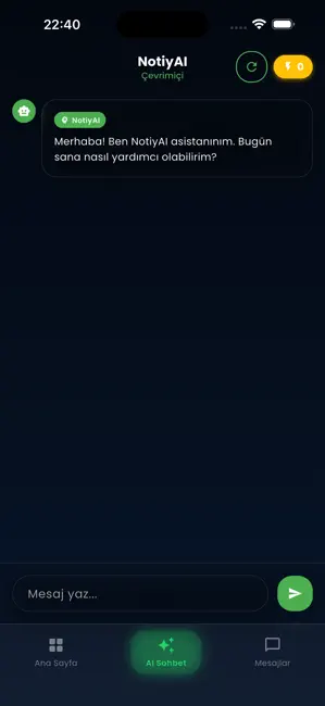
Sampled from 4 of Notifyline's App Store screenshots — background, accent and theme, measured by LaunchShots (not something Apple publishes).
#040C0C bg
#272E2E
#24D464 accent
#FFFFFF text
Reading the caption text from the screenshots in your browser…
Screenshots


Icon palette
About this app
Notifyline, kendi sohbet dışa aktarımlarını yapay zekâ ile analiz etmen için tasarlanmış kişisel bir asistandır. Hiç kimseyi takip etmez, üçüncü taraf hesap verisi toplamaz ve hiçbir şekilde başka kullanıcıları izlemez. — KENDİ SOHBETİNİ ANALİZ ET — Sana ait bir konuşma dosyasını (.txt veya .zip) Notifyline ile paylaş ya da uygulama içinden doğrudan yükle. Yapay zekâ: • Konuşma tonunu özetler • Tekrar eden konuları çıkarır • Yazışma alışkanlıklarını analiz eder • Anlamlı içgörüler sunar Tüm analiz, yalnızca senin sağladığın ve onay verdiğin dosya üzerinde yapılır. Her dışa aktarım için açık onay ekranı görürsün. — AI SOHBET ASİSTANI — NotiyAI'ya istediğin her şeyi sor. Hızlı, akıllı yanıtları doğrudan uygulama içinde al. Genel sohbet, yazma yardımı, fikir üretimi ve daha fazlası için kullan. — GİZLİLİK İLKELERİMİZ — • Hiçbir üçüncü taraf telefon numarası, hesap veya kişi verisi topl…
App details
What you can learn from Notifyline
Every shipping app on the App Store has gone through the same decisions you're working through right now: which screenshot goes first, what caption sits over it, which device frame to show, what color the background should be. The 4 screenshots above are Notifyline's answers to those questions — they're public, they're real, and they made it through Apple's review.
What the numbers say: Notifyline runs a dark set with one background colour (#040C0C) carried across every screenshot — the listing reads as a single poster when the shots sit side by side in search results. The accent colour we picked up, #24D464, is the one to reuse for badges, arrows and highlighted words if you borrow this look. Hit Use this style to open the editor with these exact colours and drop your own screenshot in.
Notice the first screenshot in particular. It's the one users see in search results and on the product page, and it's where most apps spend their best caption and tightest design. Look at the proportion of background to phone, where the text sits, what one thing the image is trying to communicate.
Want to see how other Utilities apps approach the same problem? Browse more Utilities apps in the showcase.
Take what works into your own screenshots
Open LaunchShots and design your App Store & Google Play screenshots — pick a device frame, drop captions, ship in minutes. Free, in your browser.
Open the screenshot editor →Apps with a similar look
Closest background + accent colours among the listings we've analysed — useful when you want to see the same palette handled by a different team.