Chart position — tracked daily by LaunchShots
Screenshot changes — detected by LaunchShots
Screenshot style breakdown
Sampled from 6 of Yarıştayız-TJK Bülten Tüyoları's App Store screenshots — background, accent and theme, measured by LaunchShots (not something Apple publishes).
#04142C bg
#273449
#ACF45C accent
#FFFFFF text
Reading the caption text from the screenshots in your browser…
Screenshots
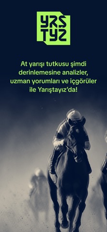


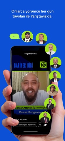
Icon palette
About this app
Yarıştayız - At Yarışı Tüyoları ve Hazır Kuponlar At yarışı tutkusunun merkezi Yarıştayız'da, sahada olanları anbean takip et! Bariyer Dibi'nin deneyimli yorumcularından, her koşu öncesi gelen kısa video analizlerle yarışın nabzını tut. Hipodrom hipodrom gezerek son dakika gelişmeleri ve bilgilere anında ulaş. Artık sadece tüyo dinlemekle kalmıyor, yorumcuların altılı ganyan kuponlarını ve favori tercihlerini de görebiliyorsun. Favori yorumcularının kuponlarını takip edebilir, kuponlarının altındaki yorumları okuyarak karar sürecini güçlendirebilirsin. Yrstyz ile Neler Yapabilirsin? Yorumculardan yarış öncesi kısa video tüyoları izle Uzmanların altılı ganyan kuponlarını ve favorilerini gör Takip ettiğin yorumcuların kupon durumlarını anlık takip et Kupon altı yorumlarını okuyarak analizlerini derinleştir Hipodrom bazlı kolay gezinme ile kaybolmadan istediğin içeriğe ulaş
App details
What you can learn from Yarıştayız-TJK Bülten Tüyoları
Every shipping app on the App Store has gone through the same decisions you're working through right now: which screenshot goes first, what caption sits over it, which device frame to show, what color the background should be. The 7 screenshots above are Yarıştayız-TJK Bülten Tüyoları's answers to those questions — they're public, they're real, and they made it through Apple's review.
What the numbers say: Yarıştayız-TJK Bülten Tüyoları runs a dark set where the background shifts from screenshot to screenshot (first shot #04142C) — each image has to stand on its own, so the captions carry more of the story. The accent colour we picked up, #ACF45C, is the one to reuse for badges, arrows and highlighted words if you borrow this look. Hit Use this style to open the editor with these exact colours and drop your own screenshot in.
Notice the first screenshot in particular. It's the one users see in search results and on the product page, and it's where most apps spend their best caption and tightest design. Look at the proportion of background to phone, where the text sits, what one thing the image is trying to communicate.
Want to see how other Sports apps approach the same problem? Browse more Sports apps in the showcase.
Take what works into your own screenshots
Open LaunchShots and design your App Store & Google Play screenshots — pick a device frame, drop captions, ship in minutes. Free, in your browser.
Open the screenshot editor →Apps with a similar look
Closest background + accent colours among the listings we've analysed — useful when you want to see the same palette handled by a different team.