Screenshot style breakdown
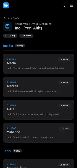
Sampled from 6 of VahiyOrg's App Store screenshots — background, accent and theme, measured by LaunchShots (not something Apple publishes).
#040404 bg
#272727
#1474DC accent
#FFFFFF text
Screenshots

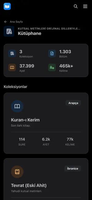
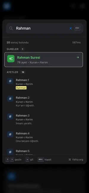
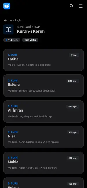
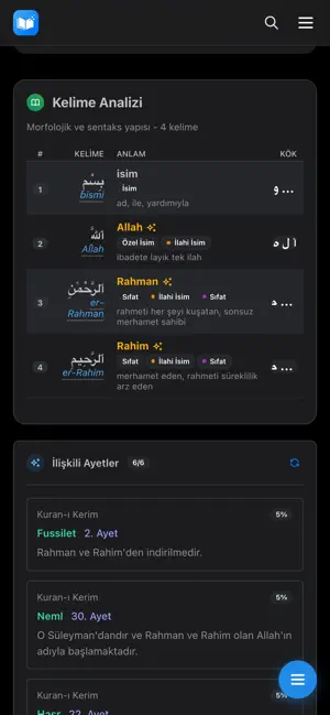
Icon palette
About this app
Vahiy.org – Yapay Zeka Destekli Morfolojik Analiz ve Kutsal Kitap Araştırma Platformu Kuran, İncil ve Tevrat metinlerini yorumlardan arındırılmış literal (birebir) çeviriler ve gelişmiş dilbilimsel araçlarla inceleyin. Vahiy.org, kutsal metinleri modern teknolojiyle analiz etmek isteyen araştırmacılar için tasarlanmış kapsamlı bir veri platformudur. TEMEL TEKNOLOJİK ÖZELLİKLER: DETAYLI MORFOLOJİK ANALİZ • Kelime Kökleri: Metindeki kelimelerin kökenine (etimoloji) inin, türetildikleri yapıları inceleyin. • Gramer Yapısı: Kelimelerin cümle içindeki türlerini, zamanlarını ve morfolojik detaylarını görüntüleyin. • Orijinal Dil Desteği: Metinleri orijinal dillerindeki yapılarıyla analiz etme imkanı. YAPAY ZEKA (AI) DESTEKLİ LİTERAL ÇEVİRİ • Birebir Anlam: Geleneksel yorumların ötesine geçerek, yapay zeka tarafından oluşturulan "literal" (kelimesi kelimesine) çevirilerle metnin özüne ula…
App details
What you can learn from VahiyOrg
Every shipping app on the App Store has gone through the same decisions you're working through right now: which screenshot goes first, what caption sits over it, which device frame to show, what color the background should be. The 6 screenshots above are VahiyOrg's answers to those questions — they're public, they're real, and they made it through Apple's review.
What the numbers say: VahiyOrg runs a dark set with one background colour (#040404) carried across every screenshot — the listing reads as a single poster when the shots sit side by side in search results. The accent colour we picked up, #1474DC, is the one to reuse for badges, arrows and highlighted words if you borrow this look. Hit Use this style to open the editor with these exact colours and drop your own screenshot in.
Notice the first screenshot in particular. It's the one users see in search results and on the product page, and it's where most apps spend their best caption and tightest design. Look at the proportion of background to phone, where the text sits, what one thing the image is trying to communicate.
Want to see how other Book apps approach the same problem? Browse more Book apps in the showcase.
Take what works into your own screenshots
Open LaunchShots and design your App Store & Google Play screenshots — pick a device frame, drop captions, ship in minutes. Free, in your browser.
Open the screenshot editor →Apps with a similar look
Closest background + accent colours among the listings we've analysed — useful when you want to see the same palette handled by a different team.