Screenshot style breakdown
Sampled from 4 of Planta Rosa - online store's App Store screenshots — background, accent and theme, measured by LaunchShots (not something Apple publishes).
#840C14 bg
#952E34
#CC848C accent
#FFFFFF text
Reading the caption text from the screenshots in your browser…
Screenshots


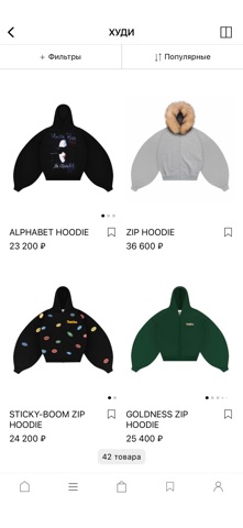

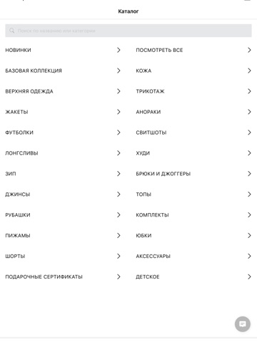
iPad screenshots


Icon palette
About this app
Planta Rosa - бренд одежды, основанный в 2021 году. Бренд сформировал устойчивое присутствие в сегменте современного fashion-streetwear с акцентом на культурный контекст и дизайнерский подход. В приложении Planta Rosa представлены разные категории одежды и аксессуаров, которые подойдут как для себя, так и в подарок. Каждая капсула имеет лимитированный тираж, продуманную концепцию и художественную идею, что придаёт изделиям коллекционный характер и формирует высокий интерес аудитории. Каждый дроп - это завершённая концепция с собственным визуальным и эмоциональным кодом. Planta Rosa выделяется культурной основой дизайна, опорой на художественные и исторические источники, ограниченными дропами, устойчивой визуальной идентичностью и универсальностью эстетического языка, понятного международной аудитории. Эти преимущества усиливают узнаваемость бренда и повышают ценность продукта. Выбирать …
App details
What you can learn from Planta Rosa - online store
Every shipping app on the App Store has gone through the same decisions you're working through right now: which screenshot goes first, what caption sits over it, which device frame to show, what color the background should be. The 7 screenshots above are Planta Rosa - online store's answers to those questions — they're public, they're real, and they made it through Apple's review.
What the numbers say: Planta Rosa - online store runs a mixed light-and-dark set where the background shifts from screenshot to screenshot (first shot #840C14) — each image has to stand on its own, so the captions carry more of the story. The accent colour we picked up, #CC848C, is the one to reuse for badges, arrows and highlighted words if you borrow this look. Hit Use this style to open the editor with these exact colours and drop your own screenshot in.
Notice the first screenshot in particular. It's the one users see in search results and on the product page, and it's where most apps spend their best caption and tightest design. Look at the proportion of background to phone, where the text sits, what one thing the image is trying to communicate.
Want to see how other Shopping apps approach the same problem? Browse more Shopping apps in the showcase.
Take what works into your own screenshots
Open LaunchShots and design your App Store & Google Play screenshots — pick a device frame, drop captions, ship in minutes. Free, in your browser.
Open the screenshot editor →Apps with a similar look
Closest background + accent colours among the listings we've analysed — useful when you want to see the same palette handled by a different team.