Chart position — tracked daily by LaunchShots
Screenshot changes — detected by LaunchShots
Screenshot style breakdown
Sampled from 6 of Taska: やることリスト&プランナー's App Store screenshots — background, accent and theme, measured by LaunchShots (not something Apple publishes).
#FCFCFC bg
#DDDDDD
#4464A4 accent
#111111 text
Screenshots




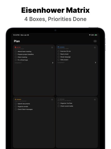
iPad screenshots
Icon palette
About this app
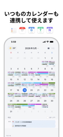
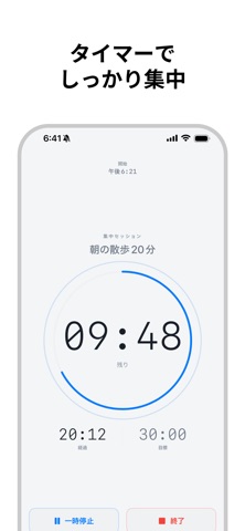
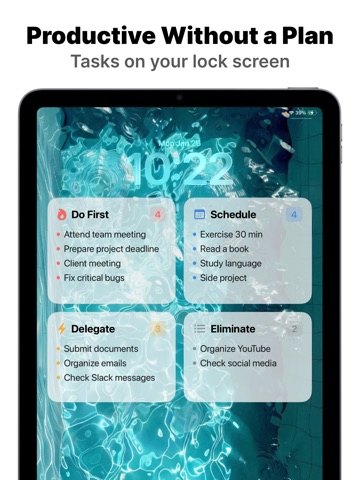
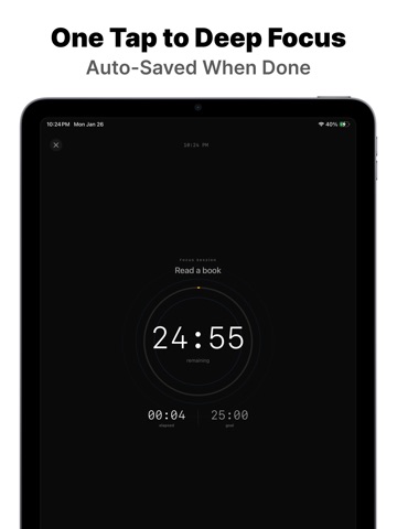
MyLogはTaskaとして新たに生まれ変わりました。 新しい名前、新しいアイコン、そしてさらに強力な機能をお届けします。 やることは山ほどあるのに、何から始めればいいかわからない。結局、何もできなかった一日。 4つのマスに放り込むだけで終わります。 4つのマスに入れるだけで、整理できます。 やることが出てきたら、4つのマスのどこかに入れてみてください。 急ぎは左、急がないものは右。重要なものは上、そうでないものは下。 これがアイゼンハワーマトリクスです。分類はこれで終わりです。 やりたいものを1つタップするとタイマーが動き出します。 終わったらiOSカレンダーに自動保存されます。 後で「今日、何したっけ?」と開いてみると、全部記録されています。 それだけです。 フォルダもなく、タグもなく、プロジェクトもありません。 やることを放り込んで、1つ選んで集中して、記録は自然と積み上がります。 [集中モード] タップ1回で開始。15分・25分・45分のプリセット、または自由設定。 ロック画面でリアルタイム確認でき、終わるとカレ…
App details
What you can learn from Taska: やることリスト&プランナー
Every shipping app on the App Store has gone through the same decisions you're working through right now: which screenshot goes first, what caption sits over it, which device frame to show, what color the background should be. The 11 screenshots above are Taska: やることリスト&プランナー's answers to those questions — they're public, they're real, and they made it through Apple's review.
What the numbers say: Taska: やることリスト&プランナー runs a light set with one background colour (#FCFCFC) carried across every screenshot — the listing reads as a single poster when the shots sit side by side in search results. The accent colour we picked up, #4464A4, is the one to reuse for badges, arrows and highlighted words if you borrow this look. Hit Use this style to open the editor with these exact colours and drop your own screenshot in.
Notice the first screenshot in particular. It's the one users see in search results and on the product page, and it's where most apps spend their best caption and tightest design. Look at the proportion of background to phone, where the text sits, what one thing the image is trying to communicate.
Want to see how other Productivity apps approach the same problem? Browse more Productivity apps in the showcase.
Take what works into your own screenshots
Open LaunchShots and design your App Store & Google Play screenshots — pick a device frame, drop captions, ship in minutes. Free, in your browser.
Open the screenshot editor →Apps with a similar look
Closest background + accent colours among the listings we've analysed — useful when you want to see the same palette handled by a different team.