Chart position — tracked daily by LaunchShots
Screenshot changes — detected by LaunchShots
Screenshot style breakdown
Sampled from 6 of Ziggur: Leitura Inteligente's App Store screenshots — background, accent and theme, measured by LaunchShots (not something Apple publishes).
#040404 bg
#272727
#3C8CD4 accent
#FFFFFF text
Screenshots


iPad screenshots




Icon palette
About this app
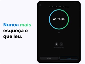
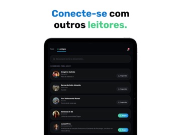
O Ziggur é um ecossistema completo para leitores que querem transformar leitura em evolução mensurável. Se você lê e sente que esquece grande parte do conteúdo, não acompanha seu progresso ou perde consistência, o Ziggur resolve isso com estrutura, dados e incentivo real. COMO FUNCIONA 1. Acompanhe sua performance Use o timer de leitura com modo foco. Durante a sessão, distrações são bloqueadas. Ao final, o app registra automaticamente tempo, páginas e aprendizados. Você passa a ter clareza sobre: Tempo total de leitura Consistência ao longo dos dias Evolução real do seu hábito 2. Retenha o que realmente importa Com o Zig, sua IA de leitura, você registra insights por áudio. Ele organiza e aprofunda suas ideias, criando uma biblioteca pessoal de aprendizados. Resultado: você para de esquecer o que lê. 3. Conecte-se com outros leitores Compartilhe suas leituras, insights e progresso.…
App details
What you can learn from Ziggur: Leitura Inteligente
Every shipping app on the App Store has gone through the same decisions you're working through right now: which screenshot goes first, what caption sits over it, which device frame to show, what color the background should be. The 16 screenshots above are Ziggur: Leitura Inteligente's answers to those questions — they're public, they're real, and they made it through Apple's review.
What the numbers say: Ziggur: Leitura Inteligente runs a dark set with one background colour (#040404) carried across every screenshot — the listing reads as a single poster when the shots sit side by side in search results. The accent colour we picked up, #3C8CD4, is the one to reuse for badges, arrows and highlighted words if you borrow this look. Hit Use this style to open the editor with these exact colours and drop your own screenshot in.
Notice the first screenshot in particular. It's the one users see in search results and on the product page, and it's where most apps spend their best caption and tightest design. Look at the proportion of background to phone, where the text sits, what one thing the image is trying to communicate.
Want to see how other Book apps approach the same problem? Browse more Book apps in the showcase.
Take what works into your own screenshots
Open LaunchShots and design your App Store & Google Play screenshots — pick a device frame, drop captions, ship in minutes. Free, in your browser.
Open the screenshot editor →Apps with a similar look
Closest background + accent colours among the listings we've analysed — useful when you want to see the same palette handled by a different team.