Chart position — tracked daily by LaunchShots
Screenshot style breakdown
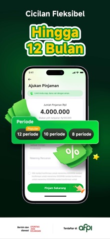
Sampled from 6 of BantuFazz-Pinjaman Dana Cepat's App Store screenshots — background, accent and theme, measured by LaunchShots (not something Apple publishes).
#04241C bg
#27423B
#04B444 accent
#FFFFFF text
Screenshots



Icon palette
About this app
BantuFazz hadir untuk bantu kebutuhan finansial Anda! Lebih cepat, lebih mudah, dan lebih nyaman untuk hidup sehari-hari. Bantu Finansial Anda, Bantu Hidup Anda. BantuFazz adalah platform LPBBTI berizin resmi dan diawasi OJK berdasarkan Keputusan OJK No. KEP-46/D.05/2020 serta anggota aktif AFPI. Kami menyediakan layanan keuangan digital yang aman, transparan, dan mudah diakses masyarakat Indonesia. Produk Pinjaman BantuFazz Pinjaman tunai tanpa jaminan dengan proses praktis dan cicilan ringan langsung melalui aplikasi. • Limit pinjaman: Rp100.000 – Rp80.000.000 • Tenor pinjaman: 91 hari – 360 hari • APR: 18% – 36% per tahun, termasuk bunga dan biaya sesuai ketentuan yang berlaku. • Jenis produk: Pinjaman Multiguna • Proses digital, aman, dan efisien Simulasi Pinjaman Contoh Simulasi Pinjaman: • Jumlah nominal pengajuan pinjaman: Rp4.000.000 • Tenor yang dipilih: 120 hari (4 bulan…
App details
What you can learn from BantuFazz-Pinjaman Dana Cepat
Every shipping app on the App Store has gone through the same decisions you're working through right now: which screenshot goes first, what caption sits over it, which device frame to show, what color the background should be. The 6 screenshots above are BantuFazz-Pinjaman Dana Cepat's answers to those questions — they're public, they're real, and they made it through Apple's review.
What the numbers say: BantuFazz-Pinjaman Dana Cepat runs a dark set with one background colour (#04241C) carried across every screenshot — the listing reads as a single poster when the shots sit side by side in search results. The accent colour we picked up, #04B444, is the one to reuse for badges, arrows and highlighted words if you borrow this look. Hit Use this style to open the editor with these exact colours and drop your own screenshot in.
Notice the first screenshot in particular. It's the one users see in search results and on the product page, and it's where most apps spend their best caption and tightest design. Look at the proportion of background to phone, where the text sits, what one thing the image is trying to communicate.
Want to see how other Finance apps approach the same problem? Browse more Finance apps in the showcase.
Take what works into your own screenshots
Open LaunchShots and design your App Store & Google Play screenshots — pick a device frame, drop captions, ship in minutes. Free, in your browser.
Open the screenshot editor →Apps with a similar look
Closest background + accent colours among the listings we've analysed — useful when you want to see the same palette handled by a different team.