Screenshot style breakdown
Sampled from 4 of SpyDiva - phone detective's App Store screenshots — background, accent and theme, measured by LaunchShots (not something Apple publishes).
#FC2C8C bg
#FC499C
#FC4434 accent
#FFFFFF text
Reading the caption text from the screenshots in your browser…
Screenshots


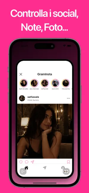
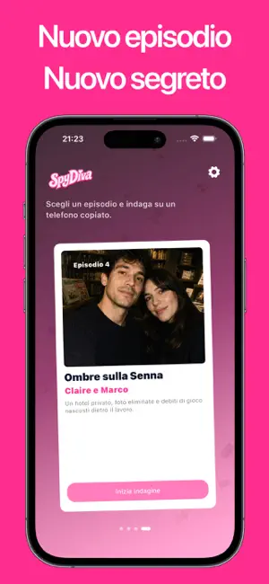
Icon palette
About this app
Spydiva è un gioco investigativo interattivo per dispositivi mobili in cui esplori uno smartphone fittizio per scoprire la verità. Foto eliminate, messaggi nascosti, file sospetti e app misteriose - tutto potrebbe essere un indizio. In ogni caso, indaghi in un ambiente digitale realistico: leggendo conversazioni, navigando sui social media, esplorando gallerie, note, calendari e persino contenuti bloccati. Ogni dettaglio conta - nulla è casuale. Per risolvere ogni caso, dovrai pensare come un vero detective: osservare attentamente, mettere in dubbio ciò che sembra ovvio e collegare gli indizi per ricostruire il quadro completo. A volte, anche il più piccolo dettaglio può cambiare tutto. Spydiva combina una narrazione coinvolgente, enigmi logici e l’atmosfera di una vera indagine. Con ogni nuova storia, i misteri diventano più complessi e la verità ancora più difficile da scoprire. -…
App details
What you can learn from SpyDiva - phone detective
Every shipping app on the App Store has gone through the same decisions you're working through right now: which screenshot goes first, what caption sits over it, which device frame to show, what color the background should be. The 4 screenshots above are SpyDiva - phone detective's answers to those questions — they're public, they're real, and they made it through Apple's review.
What the numbers say: SpyDiva - phone detective runs a dark set with one background colour (#FC2C8C) carried across every screenshot — the listing reads as a single poster when the shots sit side by side in search results. The accent colour we picked up, #FC4434, is the one to reuse for badges, arrows and highlighted words if you borrow this look. Hit Use this style to open the editor with these exact colours and drop your own screenshot in.
Notice the first screenshot in particular. It's the one users see in search results and on the product page, and it's where most apps spend their best caption and tightest design. Look at the proportion of background to phone, where the text sits, what one thing the image is trying to communicate.
Want to see how other Entertainment apps approach the same problem? Browse more Entertainment apps in the showcase.
Take what works into your own screenshots
Open LaunchShots and design your App Store & Google Play screenshots — pick a device frame, drop captions, ship in minutes. Free, in your browser.
Open the screenshot editor →Apps with a similar look
Closest background + accent colours among the listings we've analysed — useful when you want to see the same palette handled by a different team.