Screenshot style breakdown
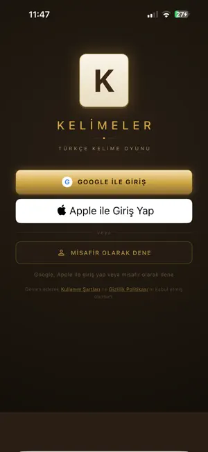
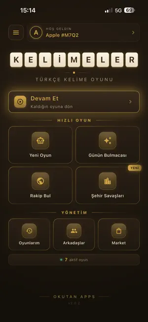
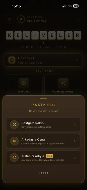
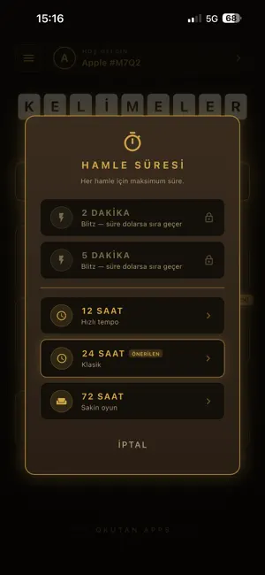
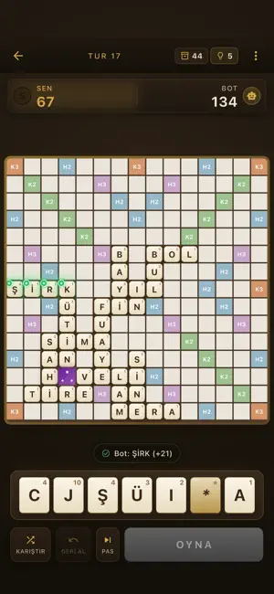
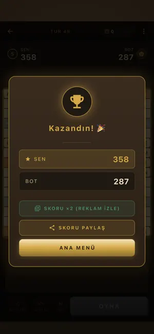
Sampled from 6 of Kelimelik Ustası's App Store screenshots — background, accent and theme, measured by LaunchShots (not something Apple publishes).
#1C140C bg
#3B342E
#9C7C3C accent
#FFFFFF text
Reading the caption text from the screenshots in your browser…
Screenshots
Icon palette
About this app
Kelimeler, klasik kelimelik oyunlarının en sevileni - Türkçe'ye özgü, sosyal, eğlenceli, rekabetçi. OYUN MODLARI RAKİP BUL Gerçek oyuncularla 1'e 1 multiplayer. 12 saat, 24 saat veya 72 saatlik turlar - sen istediğin tempoda oyna. Eşleşme sistemi ile dakikalar içinde rakip bul. HIZLI OYUN (BLITZ) (Yeni) Sabırsızlara özel: 2 veya 5 dakikalık turn süreleri. Hızlı düşün, anında hamle yap. Süre dolarsa sıra otomatik karşıya geçer. BOTA KARŞI 3 farklı zorluk seviyesinde tek kişilik mod. Strateji geliştir, kelime dağarcığını genişlet. GÜNÜN BULMACASI Her gün yeni 7 harf, 3 dakika çözüm süresi. Tüm Türkiye aynı bulmacayı çözer - sen kaç puanla bitirirsin? ŞEHİR SAVAŞLARI 81 il katılıyor. 539 yöresel kelimeyle şehrini temsil et, haftalık şampiyonluk için yarış. Liderlik tablosu canlı güncellenir. PREMIUM ÜYELİK İhtiyacına göre seç, indirimi kaçırma: - Reklam Kaldır - Sonsuza dek rekla…
App details
What you can learn from Kelimelik Ustası
Every shipping app on the App Store has gone through the same decisions you're working through right now: which screenshot goes first, what caption sits over it, which device frame to show, what color the background should be. The 6 screenshots above are Kelimelik Ustası's answers to those questions — they're public, they're real, and they made it through Apple's review.
What the numbers say: Kelimelik Ustası runs a dark set with one background colour (#1C140C) carried across every screenshot — the listing reads as a single poster when the shots sit side by side in search results. The accent colour we picked up, #9C7C3C, is the one to reuse for badges, arrows and highlighted words if you borrow this look. Hit Use this style to open the editor with these exact colours and drop your own screenshot in.
Notice the first screenshot in particular. It's the one users see in search results and on the product page, and it's where most apps spend their best caption and tightest design. Look at the proportion of background to phone, where the text sits, what one thing the image is trying to communicate.
Want to see how other Games apps approach the same problem? Browse more Games apps in the showcase.
Take what works into your own screenshots
Open LaunchShots and design your App Store & Google Play screenshots — pick a device frame, drop captions, ship in minutes. Free, in your browser.
Open the screenshot editor →Apps with a similar look
Closest background + accent colours among the listings we've analysed — useful when you want to see the same palette handled by a different team.