Chart position — tracked daily by LaunchShots
Screenshot style breakdown
Sampled from 6 of DrivePulse: Diario di Bordo's App Store screenshots — background, accent and theme, measured by LaunchShots (not something Apple publishes).
#141C24 bg
#343B42
#5C8CEC accent
#FFFFFF text
Reading the caption text from the screenshots in your browser…
Screenshots



Icon palette
About this app
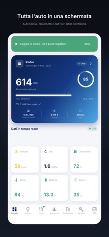
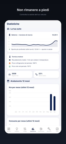
DrivePulse si collega alla presa OBD2 dell'auto con un adattatore ELM327 e tiene sul telefono viaggi, consumi, spese, scadenze e diagnosi. Nella schermata principale trovi dove hai parcheggiato, lo stato della batteria, l'autonomia, quanto hai speso e com'è andato l'ultimo viaggio. Auto, moto o scooter: un profilo per ciascuno, con dati separati. VIAGGI DI LAVORO (novità) Segni quali viaggi sono di lavoro e l'app prepara il rendiconto: odometro, chilometri, spese e ricevute, per viaggio o per periodo, in PDF e CSV. È un registro da dare al commercialista o a chi rimborsa le trasferte, non un documento con valore fiscale. RIFORNIMENTI E SCONTRINI (novità) Quando il livello del serbatoio sale, l'app ti manda una notifica con il rifornimento già compilato e lo salvi con un tocco. Vale anche per GPL, metano e ricariche in kWh. Oppure fotografi lo scontrino o il display della colonnina: l…
App details
What you can learn from DrivePulse: Diario di Bordo
Every shipping app on the App Store has gone through the same decisions you're working through right now: which screenshot goes first, what caption sits over it, which device frame to show, what color the background should be. The 10 screenshots above are DrivePulse: Diario di Bordo's answers to those questions — they're public, they're real, and they made it through Apple's review.
What the numbers say: DrivePulse: Diario di Bordo runs a dark set with one background colour (#141C24) carried across every screenshot — the listing reads as a single poster when the shots sit side by side in search results. The accent colour we picked up, #5C8CEC, is the one to reuse for badges, arrows and highlighted words if you borrow this look. Hit Use this style to open the editor with these exact colours and drop your own screenshot in.
Notice the first screenshot in particular. It's the one users see in search results and on the product page, and it's where most apps spend their best caption and tightest design. Look at the proportion of background to phone, where the text sits, what one thing the image is trying to communicate.
Want to see how other Navigation apps approach the same problem? Browse more Navigation apps in the showcase.
Take what works into your own screenshots
Open LaunchShots and design your App Store & Google Play screenshots — pick a device frame, drop captions, ship in minutes. Free, in your browser.
Open the screenshot editor →Apps with a similar look
Closest background + accent colours among the listings we've analysed — useful when you want to see the same palette handled by a different team.