Chart position — tracked daily by LaunchShots
Screenshot style breakdown
Sampled from 6 of Cash Advance Now: Borrow Money's App Store screenshots — background, accent and theme, measured by LaunchShots (not something Apple publishes).
#F404A4 bg
#F527B0
#FC84C4 accent
#FFFFFF text
Screenshots



Icon palette
About this app
FINANCIAL SUPPORT FOR THE WEEKS THAT DO NOT GO AS PLANNED This mobile app is designed for anyone who wants to manage their budget to feel clearer and less stressed when money gets tight. Cash Advance Now: Borrow Money steps in exactly when an unexpected repair, overlooked bill, or emergency expense appears that cannot be postponed. Whether you need help with household needs, urgent travel, or important monthly payments, the app makes the process straightforward and supportive. WHEN A SMALL GAP STARTS TO MATTER Often the challenge is not a big crisis, but simply the gap between a bill due now and your next payday. A broken device, utility spike, school costs, or urgent home maintenance can create immediate pressure. In these situations, a quick cash advance helps restore financial balance. Cash Advance Now: Borrow Money y is built for such moments. It offers a lighter, transparent, and …
App details
What you can learn from Cash Advance Now: Borrow Money
Every shipping app on the App Store has gone through the same decisions you're working through right now: which screenshot goes first, what caption sits over it, which device frame to show, what color the background should be. The 7 screenshots above are Cash Advance Now: Borrow Money's answers to those questions — they're public, they're real, and they made it through Apple's review.
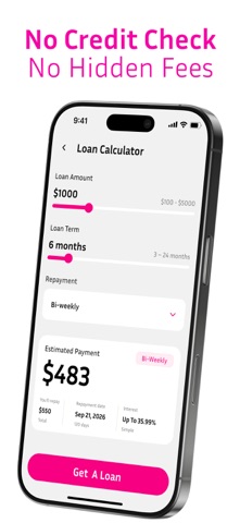
What the numbers say: Cash Advance Now: Borrow Money runs a mixed light-and-dark set where the background shifts from screenshot to screenshot (first shot #F404A4) — each image has to stand on its own, so the captions carry more of the story. The accent colour we picked up, #FC84C4, is the one to reuse for badges, arrows and highlighted words if you borrow this look. Hit Use this style to open the editor with these exact colours and drop your own screenshot in.
Notice the first screenshot in particular. It's the one users see in search results and on the product page, and it's where most apps spend their best caption and tightest design. Look at the proportion of background to phone, where the text sits, what one thing the image is trying to communicate.
Want to see how other Finance apps approach the same problem? Browse more Finance apps in the showcase.
Take what works into your own screenshots
Open LaunchShots and design your App Store & Google Play screenshots — pick a device frame, drop captions, ship in minutes. Free, in your browser.
Open the screenshot editor →Apps with a similar look
Closest background + accent colours among the listings we've analysed — useful when you want to see the same palette handled by a different team.