Chart position — tracked daily by LaunchShots
Screenshot style breakdown
Sampled from 6 of Tutma: Tuvalet Bul!'s App Store screenshots — background, accent and theme, measured by LaunchShots (not something Apple publishes).
#FCFCFC bg
#DDDDDD
#EC3C24 accent
#111111 text
Screenshots



Icon palette
About this app
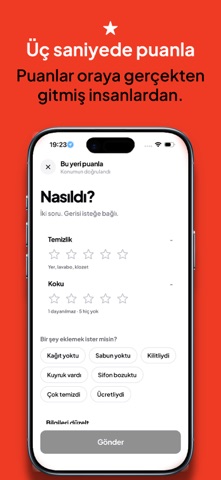
Acil bir durumda en yakın temiz tuvaleti bulmak için. Tutma, Türkiye genelinde 81 ilde ve 871 ilçede 21.000'den fazla tuvaleti haritada gösterir. Uygulamayı açtığın anda çevrendeki noktaları uzaklığıyla, puanıyla ve ücretli olup olmadığıyla görürsün. ÇOK ACİL DÜĞMESİ Tek düğme. Harita yok, liste yok, filtre yok. Uygulama senin yerine seçiyor ve doğrudan yol tarifine geçiyor. En yakını değil, en yakın temizi seçiyor: biraz daha uzaktaki bakımlı bir yer, yanı başındaki kötüsüne tercih ediliyor. GİTMEDEN ÖNCE BİL Temizlik ve koku ayrı ayrı puanlanıyor. Kağıt, sabun, taharet musluğu, bebek bakım masası, engelli erişimi ve ücret bilgisi kartta yazıyor. Bilinmiyorsa "bilgi yok" yazıyor; uydurmuyoruz. SEN DE EKLE Eksik bir tuvalet varsa fotoğrafıyla ekleyebilirsin. Puanlaman üç saniye sürüyor. Puanlar oraya gerçekten gitmiş insanlardan geliyor. HARİTADA GEZ Başka bir şehre gidecekseniz ha…
App details
What you can learn from Tutma: Tuvalet Bul!
Every shipping app on the App Store has gone through the same decisions you're working through right now: which screenshot goes first, what caption sits over it, which device frame to show, what color the background should be. The 7 screenshots above are Tutma: Tuvalet Bul!'s answers to those questions — they're public, they're real, and they made it through Apple's review.
What the numbers say: Tutma: Tuvalet Bul! runs a mixed light-and-dark set where the background shifts from screenshot to screenshot (first shot #FCFCFC) — each image has to stand on its own, so the captions carry more of the story. The accent colour we picked up, #EC3C24, is the one to reuse for badges, arrows and highlighted words if you borrow this look. Hit Use this style to open the editor with these exact colours and drop your own screenshot in.
Notice the first screenshot in particular. It's the one users see in search results and on the product page, and it's where most apps spend their best caption and tightest design. Look at the proportion of background to phone, where the text sits, what one thing the image is trying to communicate.
Want to see how other Navigation apps approach the same problem? Browse more Navigation apps in the showcase.
Take what works into your own screenshots
Open LaunchShots and design your App Store & Google Play screenshots — pick a device frame, drop captions, ship in minutes. Free, in your browser.
Open the screenshot editor →Apps with a similar look
Closest background + accent colours among the listings we've analysed — useful when you want to see the same palette handled by a different team.