Chart position — tracked daily by LaunchShots
Screenshot style breakdown
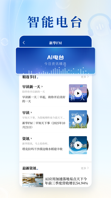
Sampled from 6 of 新华社's App Store screenshots — background, accent and theme, measured by LaunchShots (not something Apple publishes).
#143CBC bg
#3457C5
#1494FC accent
#FFFFFF text
Reading the caption text from the screenshots in your browser…
Screenshots




Icon palette
About this app
新华社客户端是新华通讯社移动端旗舰产品,汇聚国家通讯社权威与优质内容资源,持续探索移动互联网、人工智能、AR/VR、元宇宙等技术成果在媒体领域的创新应用方式。 新华社记者在哪里,你的眼睛就可以看到哪里。我们在全球拥有180余个分支机构和超过3000名记者,24小时不间断地为你带来国内外最新资讯。此时此刻发生的新闻现场,从这里就可一键直达。 我们见证并记录着新时代,也在不断尝试用创新技术构建媒体新生态。欢迎体验~
App details
What you can learn from 新华社
Every shipping app on the App Store has gone through the same decisions you're working through right now: which screenshot goes first, what caption sits over it, which device frame to show, what color the background should be. The 6 screenshots above are 新华社's answers to those questions — they're public, they're real, and they made it through Apple's review.
What the numbers say: 新华社 runs a mixed light-and-dark set where the background shifts from screenshot to screenshot (first shot #143CBC) — each image has to stand on its own, so the captions carry more of the story. The accent colour we picked up, #1494FC, is the one to reuse for badges, arrows and highlighted words if you borrow this look. Hit Use this style to open the editor with these exact colours and drop your own screenshot in.
Notice the first screenshot in particular. It's the one users see in search results and on the product page, and it's where most apps spend their best caption and tightest design. Look at the proportion of background to phone, where the text sits, what one thing the image is trying to communicate.
Want to see how other News apps approach the same problem? Browse more News apps in the showcase.
Take what works into your own screenshots
Open LaunchShots and design your App Store & Google Play screenshots — pick a device frame, drop captions, ship in minutes. Free, in your browser.
Open the screenshot editor →Apps with a similar look
Closest background + accent colours among the listings we've analysed — useful when you want to see the same palette handled by a different team.