Chart position — tracked daily by LaunchShots
Screenshot style breakdown
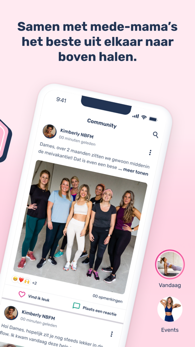
Sampled from 4 of Newborn Fit Mama's App Store screenshots — background, accent and theme, measured by LaunchShots (not something Apple publishes).
#FCBCD4 bg
#DDA5BA
#1C2C4C accent
#111111 text
Reading the caption text from the screenshots in your browser…
Screenshots


iPad screenshots


Icon palette
About this app
"Dé #1 Fitness App voor moeders’’ "Word weer een Fitte Moeder met de Newborn Fit Mama app, jouw ultieme gids op weg naar een sterker, fitter en zelfverzekerder leven.’’ Progressie Tracking Made Easy: Volg moeiteloos je ontwikkeling op het gebied van postpartum herstel, afvallen, vetverlies of het vormen van strakkere BBB's. NBFM Community:Creëer je eigen groepen, waarin samenwerken de sleutel is tot succes. Ontvang ondersteuning, deel ervaringen en bereik meer resultaten met gelijkgestemde moeders. Coach Stories: Dagelijkse tips, tricks en adviezen van onze ervaren coaches. Leer van de NBFM coaches en blijf gemotiveerd. Op naar een gezondere levensstijl! Unieke Workoutplannen:Kies uit diverse programma's op basis van je eigen tempo, niveau en voorkeuren. Van postpartum herstel tot afvallen en het vormen van specifieke spiergroepen - er is voor elk wat wils. Receptendatabase: Verwe…
App details
What you can learn from Newborn Fit Mama
Every shipping app on the App Store has gone through the same decisions you're working through right now: which screenshot goes first, what caption sits over it, which device frame to show, what color the background should be. The 8 screenshots above are Newborn Fit Mama's answers to those questions — they're public, they're real, and they made it through Apple's review.
What the numbers say: Newborn Fit Mama runs a light set where the background shifts from screenshot to screenshot (first shot #FCBCD4) — each image has to stand on its own, so the captions carry more of the story. The accent colour we picked up, #1C2C4C, is the one to reuse for badges, arrows and highlighted words if you borrow this look. Hit Use this style to open the editor with these exact colours and drop your own screenshot in.
Notice the first screenshot in particular. It's the one users see in search results and on the product page, and it's where most apps spend their best caption and tightest design. Look at the proportion of background to phone, where the text sits, what one thing the image is trying to communicate.
Want to see how other Health & Fitness apps approach the same problem? Browse more Health & Fitness apps in the showcase.
Take what works into your own screenshots
Open LaunchShots and design your App Store & Google Play screenshots — pick a device frame, drop captions, ship in minutes. Free, in your browser.
Open the screenshot editor →Apps with a similar look
Closest background + accent colours among the listings we've analysed — useful when you want to see the same palette handled by a different team.