Chart position — tracked daily by LaunchShots
Screenshot changes — detected by LaunchShots
Screenshot style breakdown
Sampled from 5 of Italienisch Lernen - Anfänger's App Store screenshots — background, accent and theme, measured by LaunchShots (not something Apple publishes).
#FCFCFC bg
#DDDDDD
#3CC43C accent
#111111 text
Screenshots


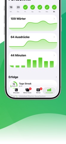

iPad screenshots


Icon palette
About this app
Sprachen lernen war noch nie so einfach! Täglich lernen immer mehr Menschen erfolgreich mit LENGO Sprachen. Werde ein Teil von uns! LENGO IST KOSTENLOS Unser Ziel ist es, Bildung für jeden zugänglich zu machen. Darum sind alle Grundfunktionen dauerhaft kostenlos nutzbar. Wir erweitern sowohl kostenpflichtige als auch kostenlose Inhalte kontinuierlich, um LENGO noch besser zu machen. WAS KANNST DU ERWARTEN? LENGO rüstet dich mit allem aus, was du benötigst, um deine Wunschsprache zu lernen. Es wurde gezeigt, dass du mit LENGO den Zeitaufwand zum Erlernen einer neuen Sprache drastisch reduzieren kannst. Dies gelingt unter anderem durch sofortiges Feedback, Wiederholung des Lernmaterials und weitere Lernmethoden. Weiterer Aspekte, die deinen Lernerfolg verbessern, sind die Motivationsmethoden, die du sicherlich auf jedem traditionellen Weg vermissen würdest. Um wirklich fit in deiner Zie…
App details
What you can learn from Italienisch Lernen - Anfänger
Every shipping app on the App Store has gone through the same decisions you're working through right now: which screenshot goes first, what caption sits over it, which device frame to show, what color the background should be. The 10 screenshots above are Italienisch Lernen - Anfänger's answers to those questions — they're public, they're real, and they made it through Apple's review.
What the numbers say: Italienisch Lernen - Anfänger runs a light set with one background colour (#FCFCFC) carried across every screenshot — the listing reads as a single poster when the shots sit side by side in search results. The accent colour we picked up, #3CC43C, is the one to reuse for badges, arrows and highlighted words if you borrow this look. Hit Use this style to open the editor with these exact colours and drop your own screenshot in.
Notice the first screenshot in particular. It's the one users see in search results and on the product page, and it's where most apps spend their best caption and tightest design. Look at the proportion of background to phone, where the text sits, what one thing the image is trying to communicate.
Want to see how other Reference apps approach the same problem? Browse more Reference apps in the showcase.
Take what works into your own screenshots
Open LaunchShots and design your App Store & Google Play screenshots — pick a device frame, drop captions, ship in minutes. Free, in your browser.
Open the screenshot editor →Apps with a similar look
Closest background + accent colours among the listings we've analysed — useful when you want to see the same palette handled by a different team.