Chart position — tracked daily by LaunchShots
Screenshot style breakdown
Sampled from 6 of Кроссворды на русском офлайн's App Store screenshots — background, accent and theme, measured by LaunchShots (not something Apple publishes).
#FCFCFC bg
#DDDDDD
#047CFC accent
#111111 text
Screenshots


iPad screenshots



Icon palette
About this app
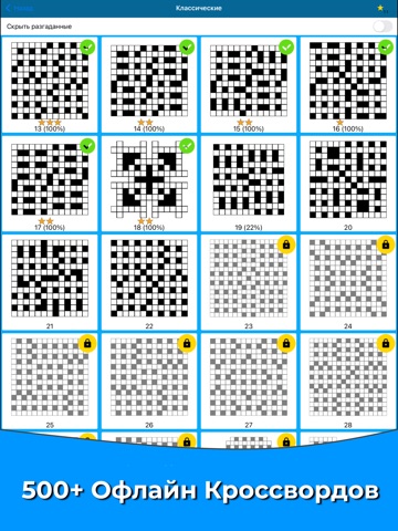
Кроссворд - классическая словесная головоломка, с ранних лет знакомая многим любителям ребусов. Разгадывайте в любом месте, в дороге или в очереди, кроссворды хранятся в вашем телефоне и не требуют подключения к сети интернет. Если вы любите сканворды, загадки, викторины - вам обязательно понравится. Способен ли Ты разгадать все уровни? Несколько категорий на выбор: - Классические - Фигурные - Тематические - Кроссворды на одну букву - Сложные Основные функции: - Все кроссворды работают оффлайн (без интернета). - Автонастройка сетки под ваш экран - Возможность изменить масштаб сетки (приблизить, если не видно) - Поддерживает тёмную тему ios - Подсказка для открытия буквы - Подсказка для открытия слова - Заморозка разгаданных слов - Режим просмотра вопросов в списке - Отличный способ скоротать время и размять извилины! - Тренируй интеллект и расширяй словарный запас! - Бонусные подсказк…
App details
What you can learn from Кроссворды на русском офлайн
Every shipping app on the App Store has gone through the same decisions you're working through right now: which screenshot goes first, what caption sits over it, which device frame to show, what color the background should be. The 15 screenshots above are Кроссворды на русском офлайн's answers to those questions — they're public, they're real, and they made it through Apple's review.
What the numbers say: Кроссворды на русском офлайн runs a mixed light-and-dark set where the background shifts from screenshot to screenshot (first shot #FCFCFC) — each image has to stand on its own, so the captions carry more of the story. The accent colour we picked up, #047CFC, is the one to reuse for badges, arrows and highlighted words if you borrow this look. Hit Use this style to open the editor with these exact colours and drop your own screenshot in.
Notice the first screenshot in particular. It's the one users see in search results and on the product page, and it's where most apps spend their best caption and tightest design. Look at the proportion of background to phone, where the text sits, what one thing the image is trying to communicate.
Want to see how other Games apps approach the same problem? Browse more Games apps in the showcase.
Take what works into your own screenshots
Open LaunchShots and design your App Store & Google Play screenshots — pick a device frame, drop captions, ship in minutes. Free, in your browser.
Open the screenshot editor →Apps with a similar look
Closest background + accent colours among the listings we've analysed — useful when you want to see the same palette handled by a different team.