Chart position — tracked daily by LaunchShots
Screenshot style breakdown
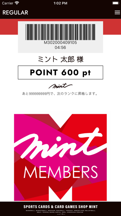
Sampled from 1 of MINTメンバーズアプリ's App Store screenshots — background, accent and theme, measured by LaunchShots (not something Apple publishes).
#140404 bg
#342727
#E4047C accent
#FFFFFF text
Screenshots
Icon palette
About this app
スポーツカード&カードゲームショップMINTの店頭や、通販サイト「MINT-MALL」のお買物で使える、MINTメンバーズポイントを貯める!使える!アプリです。 ・いままで1,000円単位でお付けしていたポイントも、今後は100円単位でポイントを加算! ・当然買取りでも100円ごとにポイントを加算いたします! ・貯まったポイントは1ポイント1円のお値引きにお使いいただけます! ・ただし、貯まったポイントには有効期限があるのでご注意ください!(最短1年~最長約2年) ・会員ランクも、今後はレギュラー、シルバーVIP、ゴールドVIP、プラチナムVIPと4段階に! ・それぞれに専用のランク表示画面をご用意いたしました! ・当然ランクが上がると、ポイント還元率がUP! ・また、MINTの通販サイト「MINT-MALL」とも連携!お店で貯めたポイントを通信販売で利用したり、 もちろんその逆も可能!
App details
What you can learn from MINTメンバーズアプリ
Every shipping app on the App Store has gone through the same decisions you're working through right now: which screenshot goes first, what caption sits over it, which device frame to show, what color the background should be. The 1 screenshots above are MINTメンバーズアプリ's answers to those questions — they're public, they're real, and they made it through Apple's review.
What the numbers say: MINTメンバーズアプリ runs a dark set with one background colour (#140404) carried across every screenshot — the listing reads as a single poster when the shots sit side by side in search results. The accent colour we picked up, #E4047C, is the one to reuse for badges, arrows and highlighted words if you borrow this look. Hit Use this style to open the editor with these exact colours and drop your own screenshot in.
Notice the first screenshot in particular. It's the one users see in search results and on the product page, and it's where most apps spend their best caption and tightest design. Look at the proportion of background to phone, where the text sits, what one thing the image is trying to communicate.
Want to see how other Lifestyle apps approach the same problem? Browse more Lifestyle apps in the showcase.
Take what works into your own screenshots
Open LaunchShots and design your App Store & Google Play screenshots — pick a device frame, drop captions, ship in minutes. Free, in your browser.
Open the screenshot editor →Apps with a similar look
Closest background + accent colours among the listings we've analysed — useful when you want to see the same palette handled by a different team.