Screenshots

Icon palette
About this app
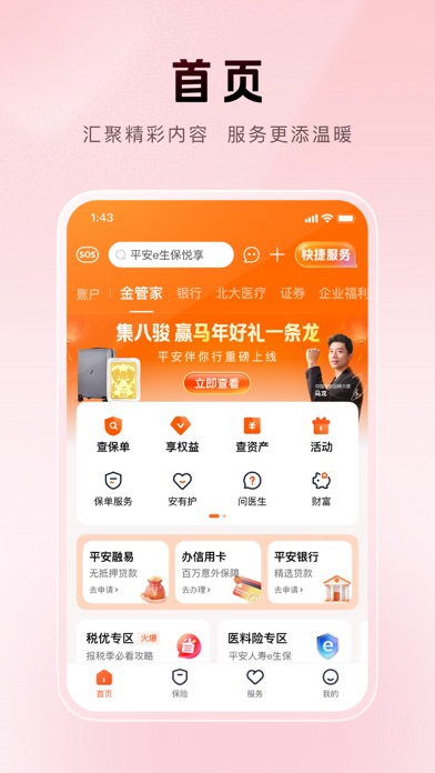
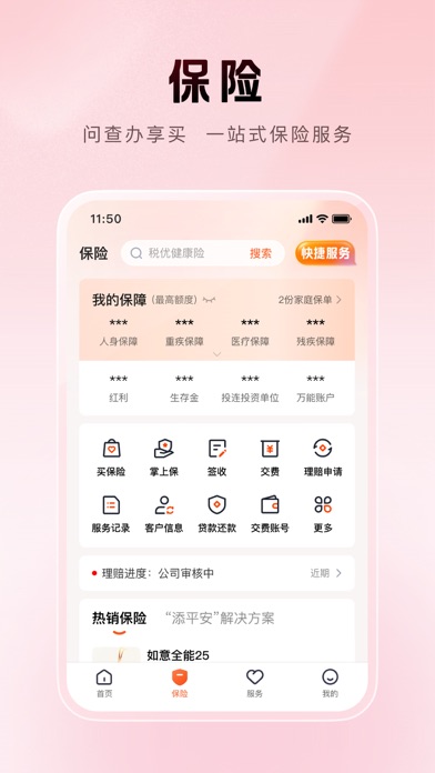
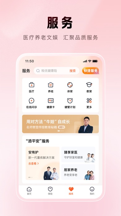
【专业的保险服务管家——十载精进,点10成金】 平安金管家10.0全新升级,保险、服务、权益板块全面升级,功能精简、设计优化,旨在为您提供更便捷的优质服务体验! 【升级保险频道】 ①构建保险资金区,新增保障额度及缺口展示 ②保单服务按保险销售生命周期排列,并突出常用保单服务 ③新增“添平安”解决方案 ④新增本地资讯功能 【新增服务频道】 ①整合医疗、养老、健康服务 ②扩充体育、教育、人文等多元俱乐部 【重构权益体系】 ①权益聚合展示,高频使用权益越用越爱用 ②权益等级升级,路径更清晰 ③新增客户权益介绍一键预约服务 【优化用户体验】 ①频道精简“5”变“4” ②功能去繁存简,首页聚焦核心服务,生活商城移至主入口区 ③“我的”频道精简至一屏展示
App details
What you can learn from 平安金管家-值得信赖的财富生活管家
Every shipping app on the App Store has gone through the same decisions you're working through right now: which screenshot goes first, what caption sits over it, which device frame to show, what color the background should be. The 4 screenshots above are 平安金管家-值得信赖的财富生活管家's answers to those questions — they're public, they're real, and they made it through Apple's review.
Notice the first screenshot in particular. It's the one users see in search results and on the product page, and it's where most apps spend their best caption and tightest design. Look at the proportion of background to phone, where the text sits, what one thing the image is trying to communicate.
Want to see how other Finance apps approach the same problem? Browse more Finance apps in the showcase.
Take what works into your own screenshots
Open LaunchShots and design your App Store & Google Play screenshots — pick a device frame, drop captions, ship in minutes. Free, in your browser.
Open the screenshot editor →