Chart position — tracked daily by LaunchShots
Screenshot style breakdown
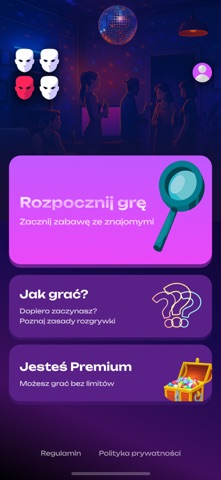
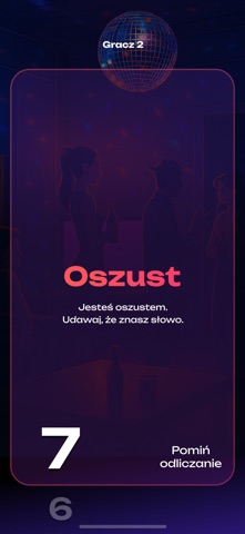
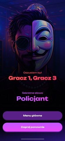
Sampled from 6 of Impostor Po Polsku's App Store screenshots — background, accent and theme, measured by LaunchShots (not something Apple publishes).
#04144C bg
#273465
#5C1C84 accent
#FFFFFF text
Screenshots


Icon palette
About this app
Dynamiczna gra imprezowa, w której nikt nie może czuć się bezpiecznie. Na początku każdej rundy większość graczy otrzymuje to samo sekretne słowo. Większość, ale nie wszyscy. Jedna lub kilka osób trafia na rolę oszusta i nie ma pojęcia, jakie jest hasło. Od tego momentu zaczyna się festiwal blefu, improwizacji i bardzo podejrzanych odpowiedzi. Gracze po kolei opisują słowo, próbując udowodnić, że je znają, jednocześnie nie zdradzając go wprost. Zbyt dokładny opis może naprowadzić oszusta, zbyt ogólny sprawi, że wszyscy spojrzą właśnie na ciebie. Oszuści w tym czasie kombinują, podłapują cudze wypowiedzi i robią wszystko, by brzmieć wiarygodnie. Każda runda szybko zamienia się w chaos pełen śmiechu, oskarżeń i teorii spiskowych. Celem gry jest zdemaskowanie oszusta, zanim będzie za późno, lub przetrwanie do końca rundy, jeśli to właśnie ty nim jesteś. Gra nagradza spryt, kreatywność i …
App details
What you can learn from Impostor Po Polsku
Every shipping app on the App Store has gone through the same decisions you're working through right now: which screenshot goes first, what caption sits over it, which device frame to show, what color the background should be. The 6 screenshots above are Impostor Po Polsku's answers to those questions — they're public, they're real, and they made it through Apple's review.
What the numbers say: Impostor Po Polsku runs a dark set where the background shifts from screenshot to screenshot (first shot #04144C) — each image has to stand on its own, so the captions carry more of the story. The accent colour we picked up, #5C1C84, is the one to reuse for badges, arrows and highlighted words if you borrow this look. Hit Use this style to open the editor with these exact colours and drop your own screenshot in.
Notice the first screenshot in particular. It's the one users see in search results and on the product page, and it's where most apps spend their best caption and tightest design. Look at the proportion of background to phone, where the text sits, what one thing the image is trying to communicate.
Want to see how other Entertainment apps approach the same problem? Browse more Entertainment apps in the showcase.
Take what works into your own screenshots
Open LaunchShots and design your App Store & Google Play screenshots — pick a device frame, drop captions, ship in minutes. Free, in your browser.
Open the screenshot editor →Apps with a similar look
Closest background + accent colours among the listings we've analysed — useful when you want to see the same palette handled by a different team.