Chart position — tracked daily by LaunchShots
Screenshot changes — detected by LaunchShots
Screenshot style breakdown
Sampled from 6 of HalıSaha+ Rezervasyon, Kadro's App Store screenshots — background, accent and theme, measured by LaunchShots (not something Apple publishes).
#040C0C bg
#272E2E
#3CB404 accent
#FFFFFF text
- #1HalhSaha+
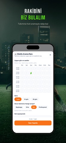
- #2MAÇINI BİZ BULALIM Müsait saatini seç, dakikalar içinde eşleş.
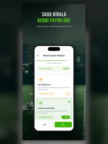
- #4SAHA KIRALA KENDİ PAYINI ÖDE
- #5TURNUVAYA KATIL
- #6TRİBÜNDE PAYLAŞ
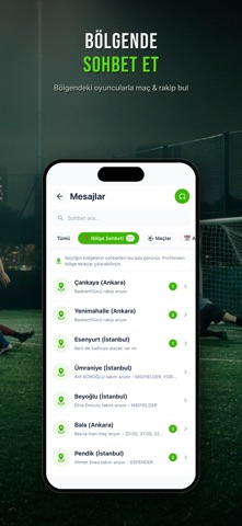
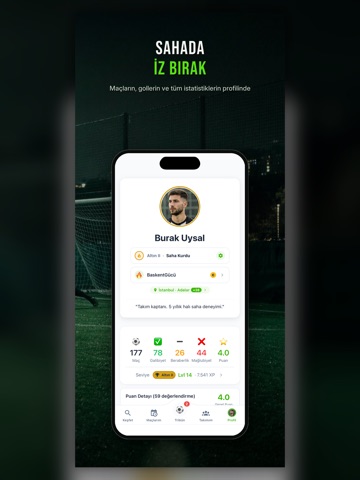
Captions read from the screenshots (OCR, may contain small errors): 5 headlines, 3.8 words on average (longest 9), mostly ALL CAPS.
Screenshots





iPad screenshots




Icon palette
About this app
Oyuncuysan maçını, kaptansan rakibini biz bulalım — Hızlı Maç Bul ile. İlçeni ve boş saatlerini seç, onayla, güvenli online öde; tek yapman gereken sahaya gelip oynamak. Halı Saha+ (eski adıyla SahaGol) yalnız bir halı saha rezervasyon uygulaması değil: oyuncuyu, turnuva organizatörünü ve işletmeyi tek çatıda buluşturan futbol ekosistemi. HIZLI MAÇ BUL — TAKIMIN YOKSA BİLE • Mevkini, seviyeni, ilçeni ve boş saatlerini seç • Yapay zekâ seni performans puanına ve oyun sertliğine göre en dengeli maça yerleştirir • "Seni Bekleyen Maçlar" ile sana biçilmiş maçları anında gör • "+1 Arkadaş" ile bir dostunu çağır, aynı maçı birlikte arayın GÜVEN PUANI — MAÇ İPTALİ DERDİ BİTSİN • Halı Saha+ Güven Puanı, maçı satıp ekibi yarı yolda bırakanları filtreler • Her oyuncunun katılım güvenilirliği profilinde görünür • Söz veren sahaya gelir: kadro dolduysa o maç oynanır, takımın yarı yolda kalmaz H…
App details
What you can learn from HalıSaha+ Rezervasyon, Kadro
Every shipping app on the App Store has gone through the same decisions you're working through right now: which screenshot goes first, what caption sits over it, which device frame to show, what color the background should be. The 16 screenshots above are HalıSaha+ Rezervasyon, Kadro's answers to those questions — they're public, they're real, and they made it through Apple's review.
What the numbers say: HalıSaha+ Rezervasyon, Kadro runs a dark set with one background colour (#040C0C) carried across every screenshot — the listing reads as a single poster when the shots sit side by side in search results. The accent colour we picked up, #3CB404, is the one to reuse for badges, arrows and highlighted words if you borrow this look. Hit Use this style to open the editor with these exact colours and drop your own screenshot in.
Notice the first screenshot in particular. It's the one users see in search results and on the product page, and it's where most apps spend their best caption and tightest design. Look at the proportion of background to phone, where the text sits, what one thing the image is trying to communicate.
Want to see how other Sports apps approach the same problem? Browse more Sports apps in the showcase.
Take what works into your own screenshots
Open LaunchShots and design your App Store & Google Play screenshots — pick a device frame, drop captions, ship in minutes. Free, in your browser.
Open the screenshot editor →Apps with a similar look
Closest background + accent colours among the listings we've analysed — useful when you want to see the same palette handled by a different team.