Chart position — tracked daily by LaunchShots
Screenshot style breakdown
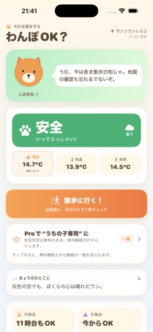
Sampled from 4 of wanpo - わんぽOK?'s App Store screenshots — background, accent and theme, measured by LaunchShots (not something Apple publishes).
#FCF4EC bg
#DDD6CF
#4CB474 accent
#111111 text
Screenshots


Icon palette
About this app
「wanpo - わんぽOK?」は、犬の散歩前に現在地の天気、気温、体感温度、推定路面温度を確認するアプリです。 アスファルト、コンクリート、芝生・土から路面を選び、「安全・注意・中止」の目安を表示します。 路面温度は、日射量、風、湿度、雨、地表面温度などの気象データから推定し、誤差の目安も表示します。 散歩前には、手のひらを地面へ7秒当てる安全チェックを案内します。熱くて我慢できない場合は、散歩を中止してください。 雨や雪の日は、選択中の犬キャラクターが水色のカッパ姿に自動で切り替わります。散歩スタート後に任意の広告を視聴すると肉球ポイントを獲得でき、貯めたポイントを消費して新しいキャラクターと交換できます。広告は7秒の安全チェック中には表示されず、安全判定にも影響しません。 基本的な安全判定は無料で利用できます。 買い切りのwanpo Proでは、うちの子詳細補正、複数犬プロフィール、保存地点、通知カスタム、ホーム画面Widget、散歩ログ、家族共有、全キャラクターなどを利用できます。 本アプリが表示する路面…
App details
What you can learn from wanpo - わんぽOK?
Every shipping app on the App Store has gone through the same decisions you're working through right now: which screenshot goes first, what caption sits over it, which device frame to show, what color the background should be. The 4 screenshots above are wanpo - わんぽOK?'s answers to those questions — they're public, they're real, and they made it through Apple's review.
What the numbers say: wanpo - わんぽOK? runs a light set where the background shifts from screenshot to screenshot (first shot #FCF4EC) — each image has to stand on its own, so the captions carry more of the story. The accent colour we picked up, #4CB474, is the one to reuse for badges, arrows and highlighted words if you borrow this look. Hit Use this style to open the editor with these exact colours and drop your own screenshot in.
Notice the first screenshot in particular. It's the one users see in search results and on the product page, and it's where most apps spend their best caption and tightest design. Look at the proportion of background to phone, where the text sits, what one thing the image is trying to communicate.
Want to see how other Weather apps approach the same problem? Browse more Weather apps in the showcase.
Take what works into your own screenshots
Open LaunchShots and design your App Store & Google Play screenshots — pick a device frame, drop captions, ship in minutes. Free, in your browser.
Open the screenshot editor →Apps with a similar look
Closest background + accent colours among the listings we've analysed — useful when you want to see the same palette handled by a different team.