Chart position — tracked daily by LaunchShots
Screenshot style breakdown
Sampled from 6 of TeamCollect: Boetepot App's App Store screenshots — background, accent and theme, measured by LaunchShots (not something Apple publishes).
#7C94B4 bg
#6D829E
#1C1C54 accent
#111111 text
Screenshots




iPad screenshots




Icon palette
About this app
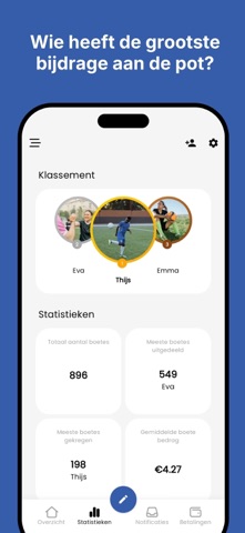
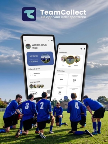
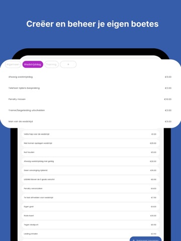
TeamCollect maakt het beheren van de teamkas simpel en transparant: boetes, gedeelde kosten, spaardoelen en de teamkalender, allemaal op één plek. Perfect voor elk sportteam Of je nu voetbalt, hockeyt of een andere sport beoefent, TeamCollect houdt de teamkas overzichtelijk, zodat niemand meer hoeft uit te zoeken wie nog moet betalen. Boetes beheren - Maak eigen boeteregels aan - Leg boetes op aan teamleden - Houd bij wie betaald heeft en wie niet - Bekijk statistieken en ranglijsten Makkelijk betalen - Betaal direct via een betaallink, snel en veilig - Automatische berichtgeving bij te late betalingen - Altijd een duidelijk overzicht van openstaande bedragen Kosten verdelen - Verdeel bonnetjes eerlijk onder teamleden - Beheer betaalrondes - Houd bij wie nog moet betalen Spaardoelen - Stel een spaardoel in voor het team - Periodieke inleg per teamlid - Volg de voortgang samen Take…
App details
What you can learn from TeamCollect: Boetepot App
Every shipping app on the App Store has gone through the same decisions you're working through right now: which screenshot goes first, what caption sits over it, which device frame to show, what color the background should be. The 16 screenshots above are TeamCollect: Boetepot App's answers to those questions — they're public, they're real, and they made it through Apple's review.
What the numbers say: TeamCollect: Boetepot App runs a mixed light-and-dark set where the background shifts from screenshot to screenshot (first shot #7C94B4) — each image has to stand on its own, so the captions carry more of the story. The accent colour we picked up, #1C1C54, is the one to reuse for badges, arrows and highlighted words if you borrow this look. Hit Use this style to open the editor with these exact colours and drop your own screenshot in.
Notice the first screenshot in particular. It's the one users see in search results and on the product page, and it's where most apps spend their best caption and tightest design. Look at the proportion of background to phone, where the text sits, what one thing the image is trying to communicate.
Want to see how other Sports apps approach the same problem? Browse more Sports apps in the showcase.
Take what works into your own screenshots
Open LaunchShots and design your App Store & Google Play screenshots — pick a device frame, drop captions, ship in minutes. Free, in your browser.
Open the screenshot editor →Apps with a similar look
Closest background + accent colours among the listings we've analysed — useful when you want to see the same palette handled by a different team.