Chart position — tracked daily by LaunchShots
Screenshot style breakdown
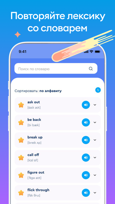
Sampled from 6 of Английский язык English Galaxy's App Store screenshots — background, accent and theme, measured by LaunchShots (not something Apple publishes).
#0C9CE4 bg
#2EA9E7
#8C6CFC accent
#FFFFFF text
Screenshots

Icon palette
About this app
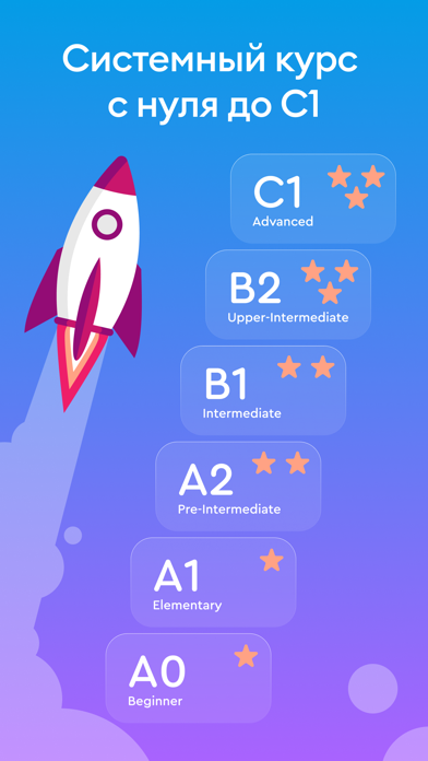
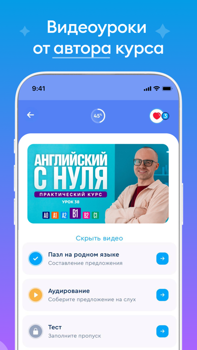
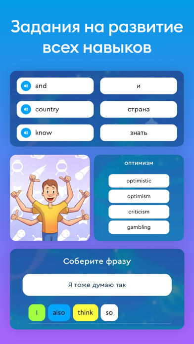
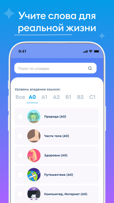
English Galaxy - уникальное приложение для тех, кто хочет выучить английский язык с нуля до продвинутого уровня по грамматике и словарному запасу одновременно. Наша система обучения разработана на основе уникального авторского курса, который не имеет аналогов. Данный авторский курс английского языка состоит из 6 уровней, где представлены уроки английского языка с нуля до продвинутого уровня (A0 - C1). Данные уровни английского языка в приложении соответствуют международной шкале: A0 – английский с нуля A1 – английский для начинающих A2, B1 – английский язык для среднего уровня B2, C1 – английский язык для продвинутых Вы можете выбрать любой уровень и начать заниматься. Проходите уроки английского языка бесплатно и чувствуйте реальный прогресс. Максимально качественная практика для всех уровней: 50 уроков в каждом уровне, более 5000 практических упражнений на каждый уровень, р…
App details
What you can learn from Английский язык English Galaxy
Every shipping app on the App Store has gone through the same decisions you're working through right now: which screenshot goes first, what caption sits over it, which device frame to show, what color the background should be. The 6 screenshots above are Английский язык English Galaxy's answers to those questions — they're public, they're real, and they made it through Apple's review.
What the numbers say: Английский язык English Galaxy runs a mixed light-and-dark set where the background shifts from screenshot to screenshot (first shot #0C9CE4) — each image has to stand on its own, so the captions carry more of the story. The accent colour we picked up, #8C6CFC, is the one to reuse for badges, arrows and highlighted words if you borrow this look. Hit Use this style to open the editor with these exact colours and drop your own screenshot in.
Notice the first screenshot in particular. It's the one users see in search results and on the product page, and it's where most apps spend their best caption and tightest design. Look at the proportion of background to phone, where the text sits, what one thing the image is trying to communicate.
Want to see how other Education apps approach the same problem? Browse more Education apps in the showcase.
Take what works into your own screenshots
Open LaunchShots and design your App Store & Google Play screenshots — pick a device frame, drop captions, ship in minutes. Free, in your browser.
Open the screenshot editor →Apps with a similar look
Closest background + accent colours among the listings we've analysed — useful when you want to see the same palette handled by a different team.